quip — impression kit and whitening dtc packaging
brief
create a custom dtc whitening system to support quip’s expansion into this lucrative market category
curate an easy, accessible, and intuitive customer experience
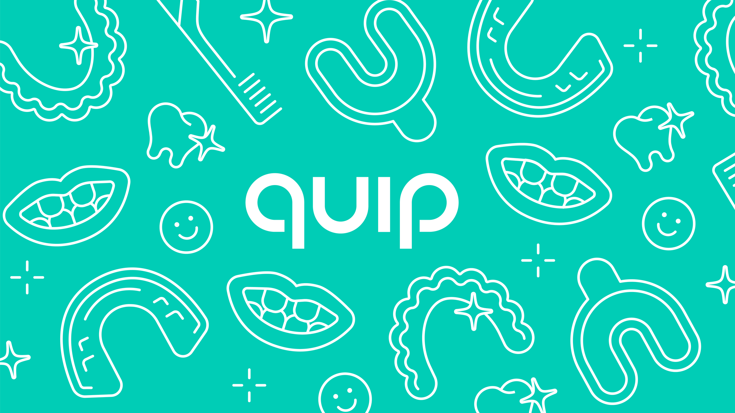
maintain quip’s evergreen visuals
responsibilities
campaign strategy
graphic design
illustration
production files
sampling
supplier feedback
final files for mass production
outcome
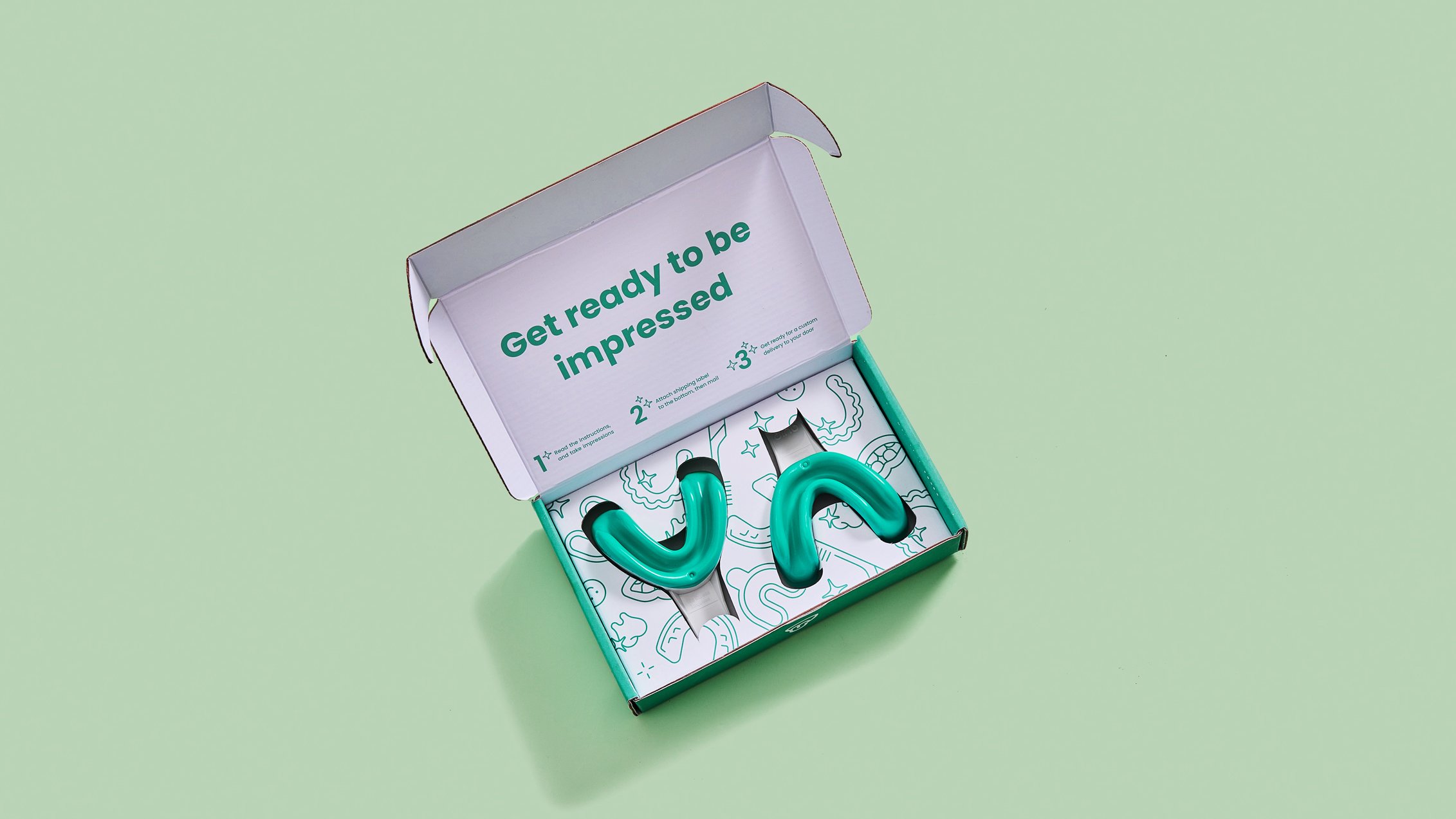
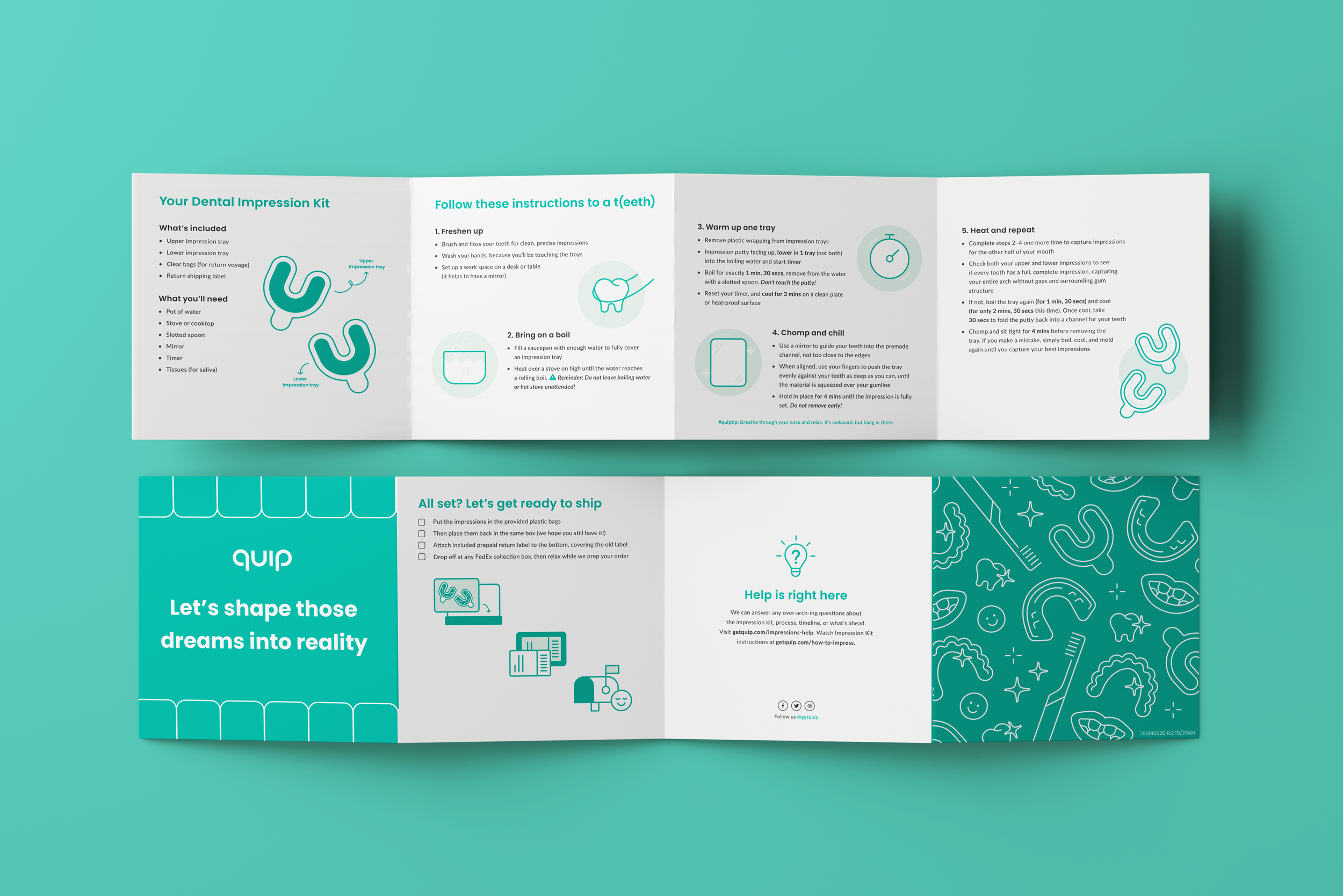
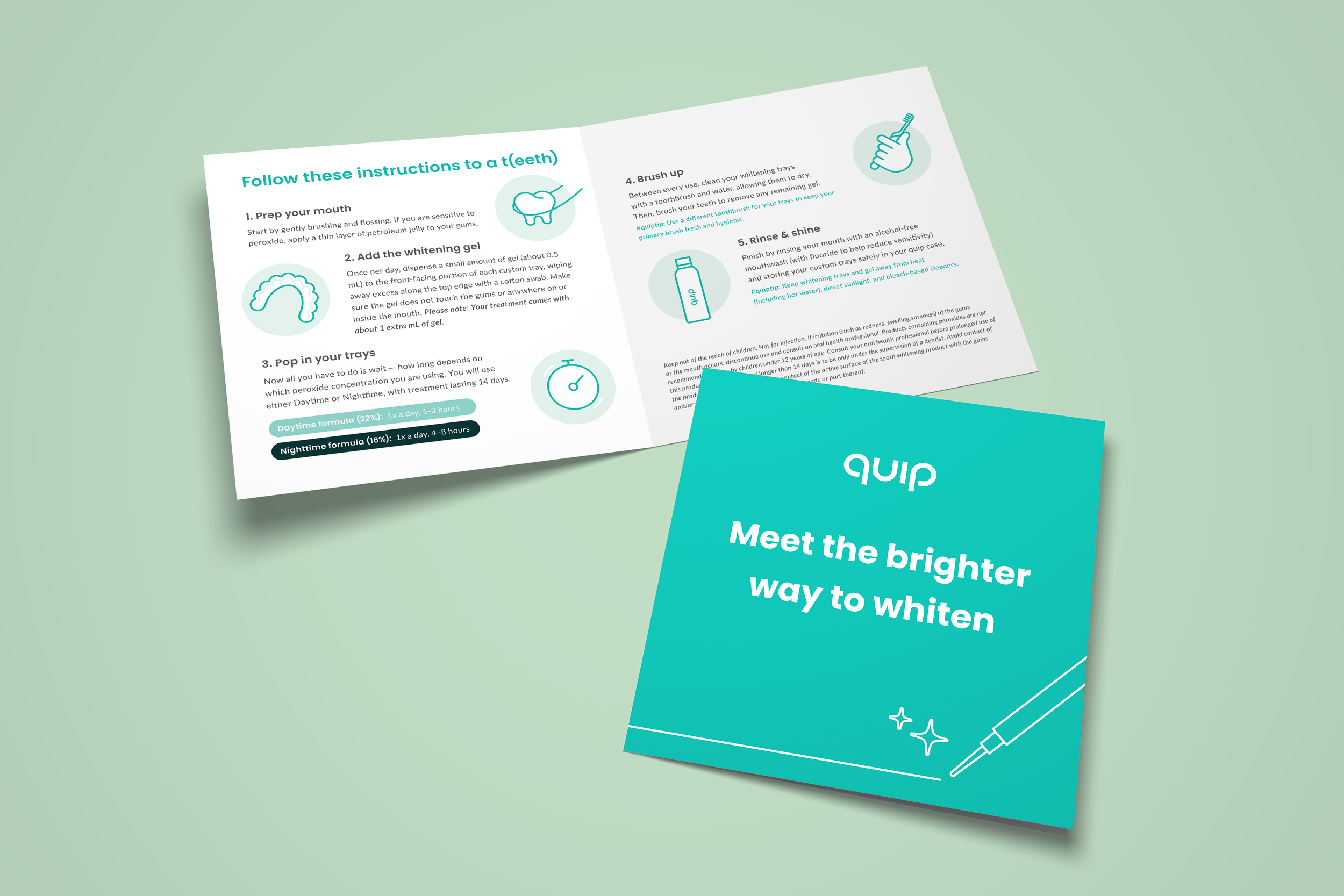
customer experience: packaging intuitively explains how to take teeth impressions and receive custom trays.
customer education: Friendly illustrations and accessible user guides demystify the use of clinical-grade dental products at home.
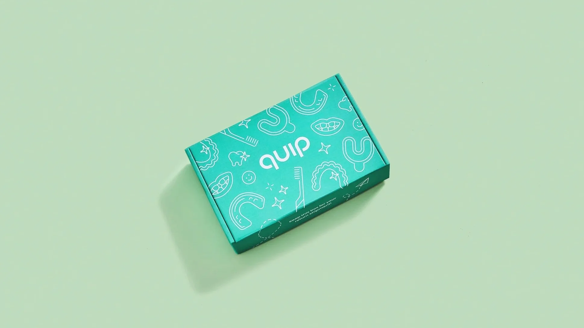
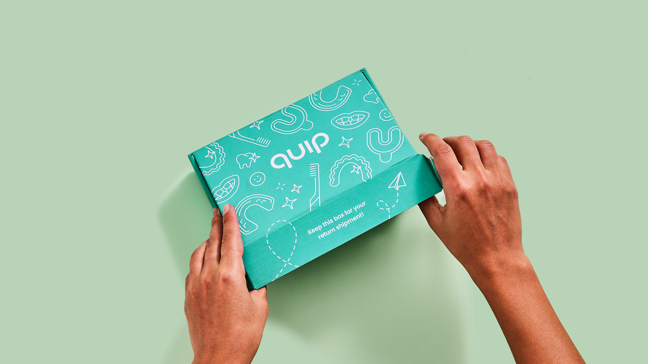
branding: packaging reflects core quip branding by maintaining quip’s green spot color, typography, illustrations, and copy standards.
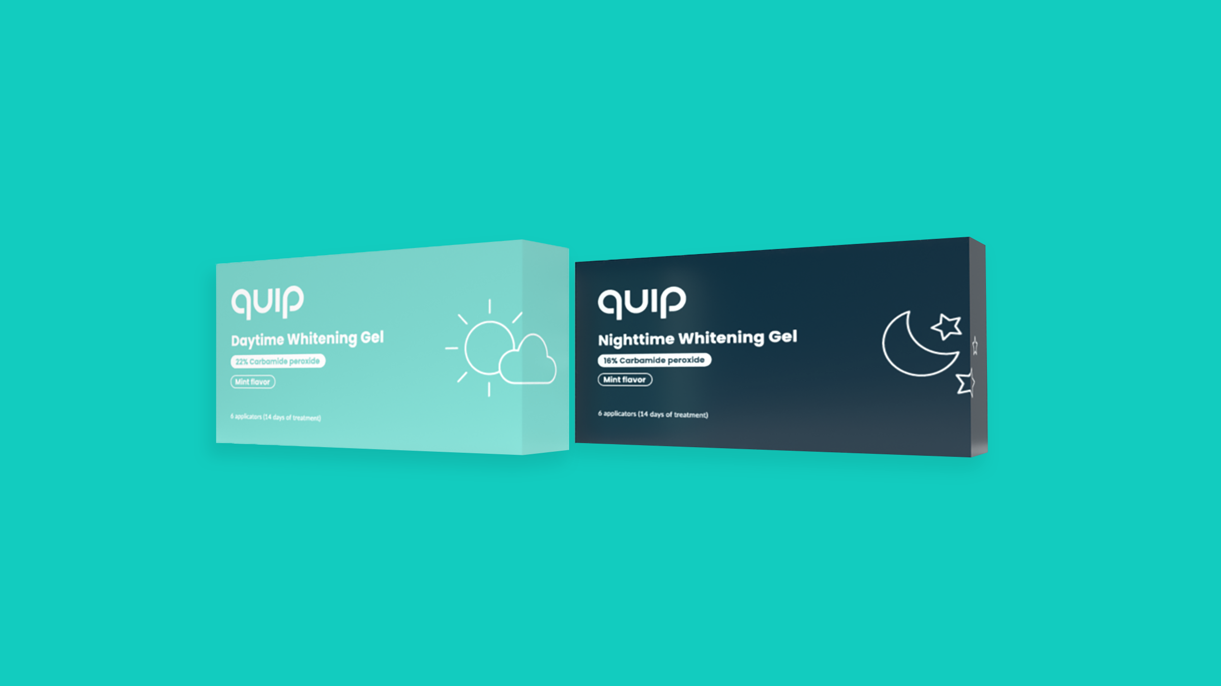
brand expansion: new colors and spot illustrations engage customers and clearly differentiate clinical options within quip’s whitening system.
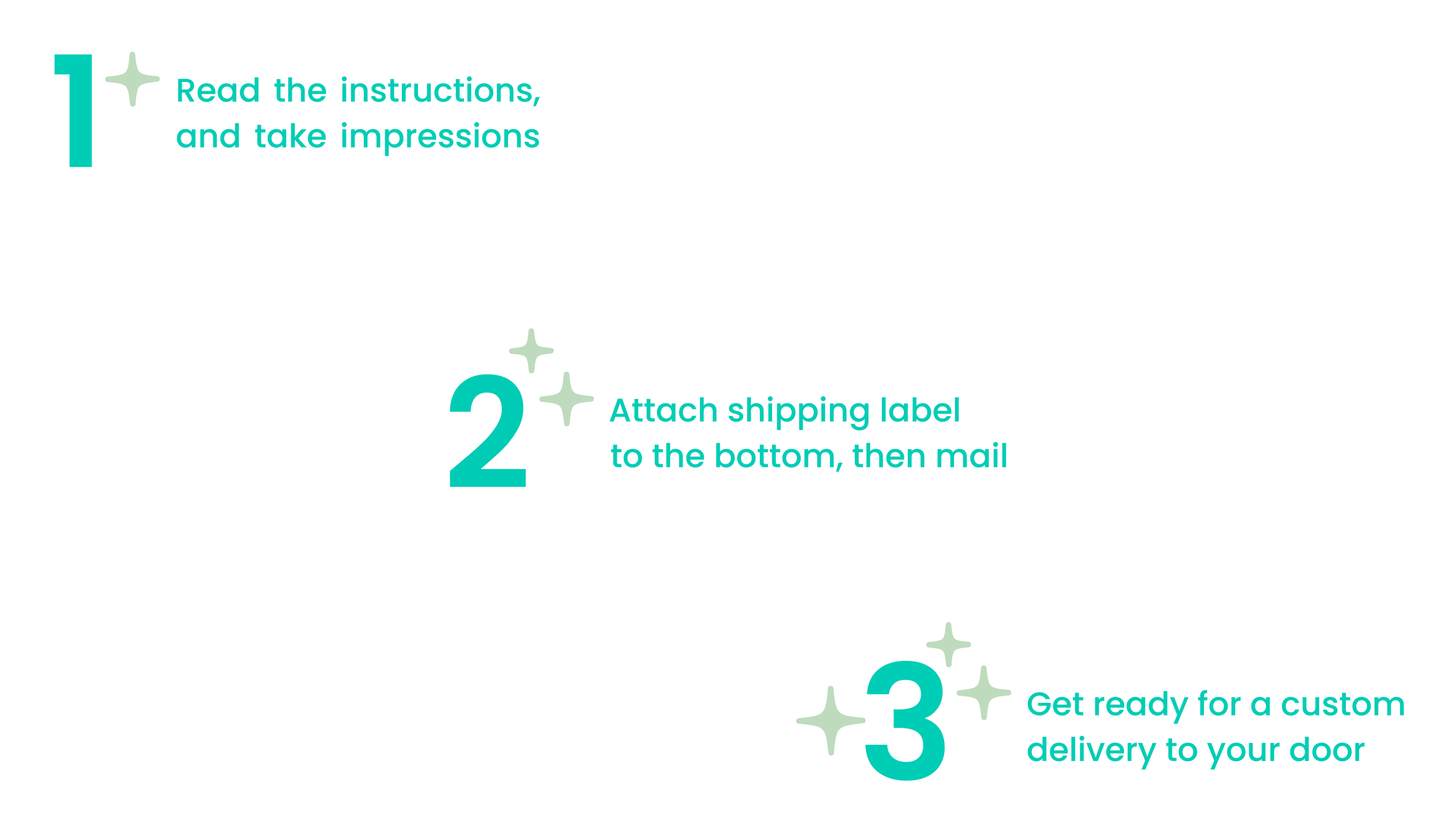
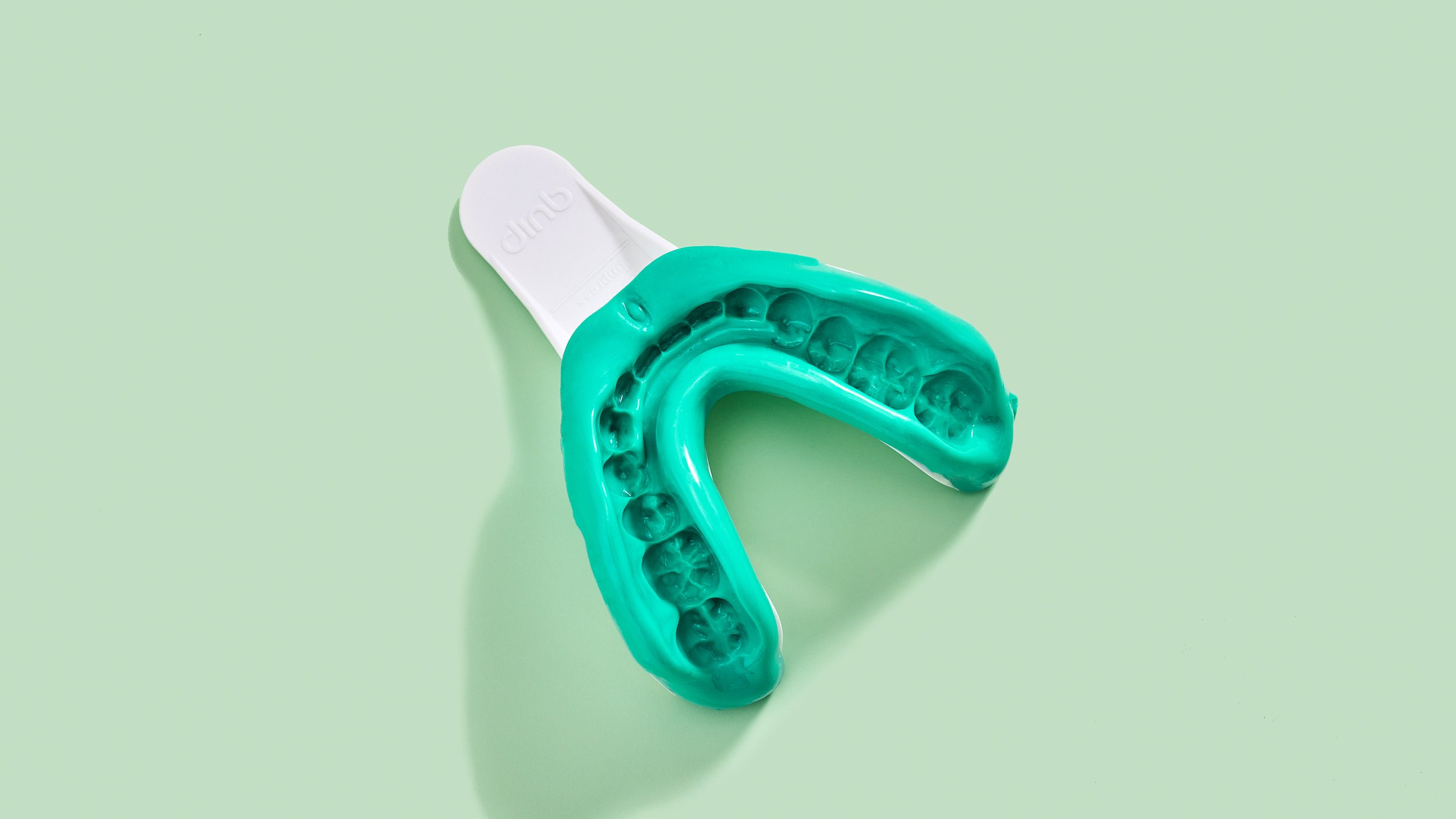
impression kit
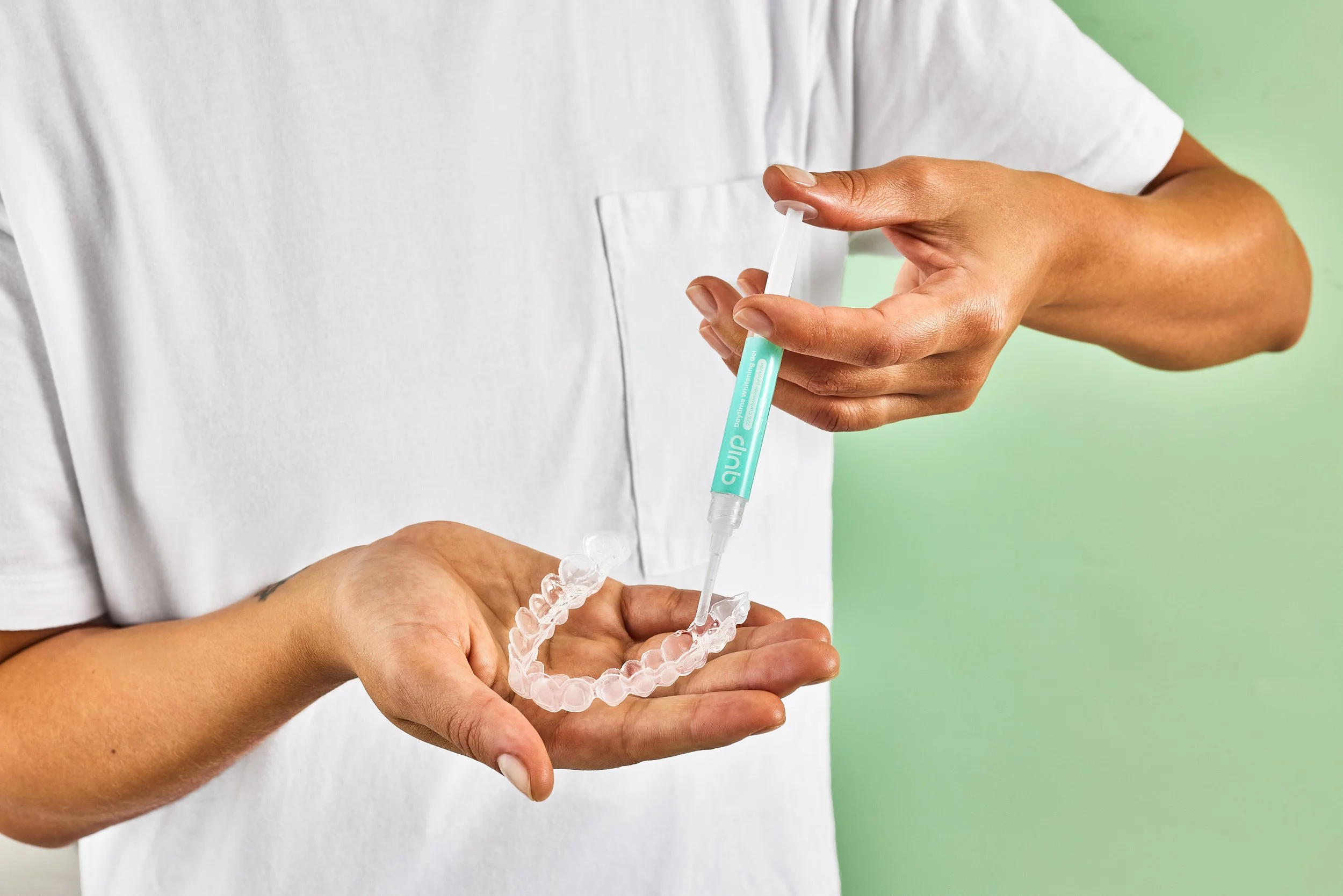
before receiving their custom whitening trays, customers order quip’s easy-to-use impression kit. after taking impressions of their teeth, customers simply drop the impression kit in the mail. after several weeks, quip sends out an individualized whitening system.
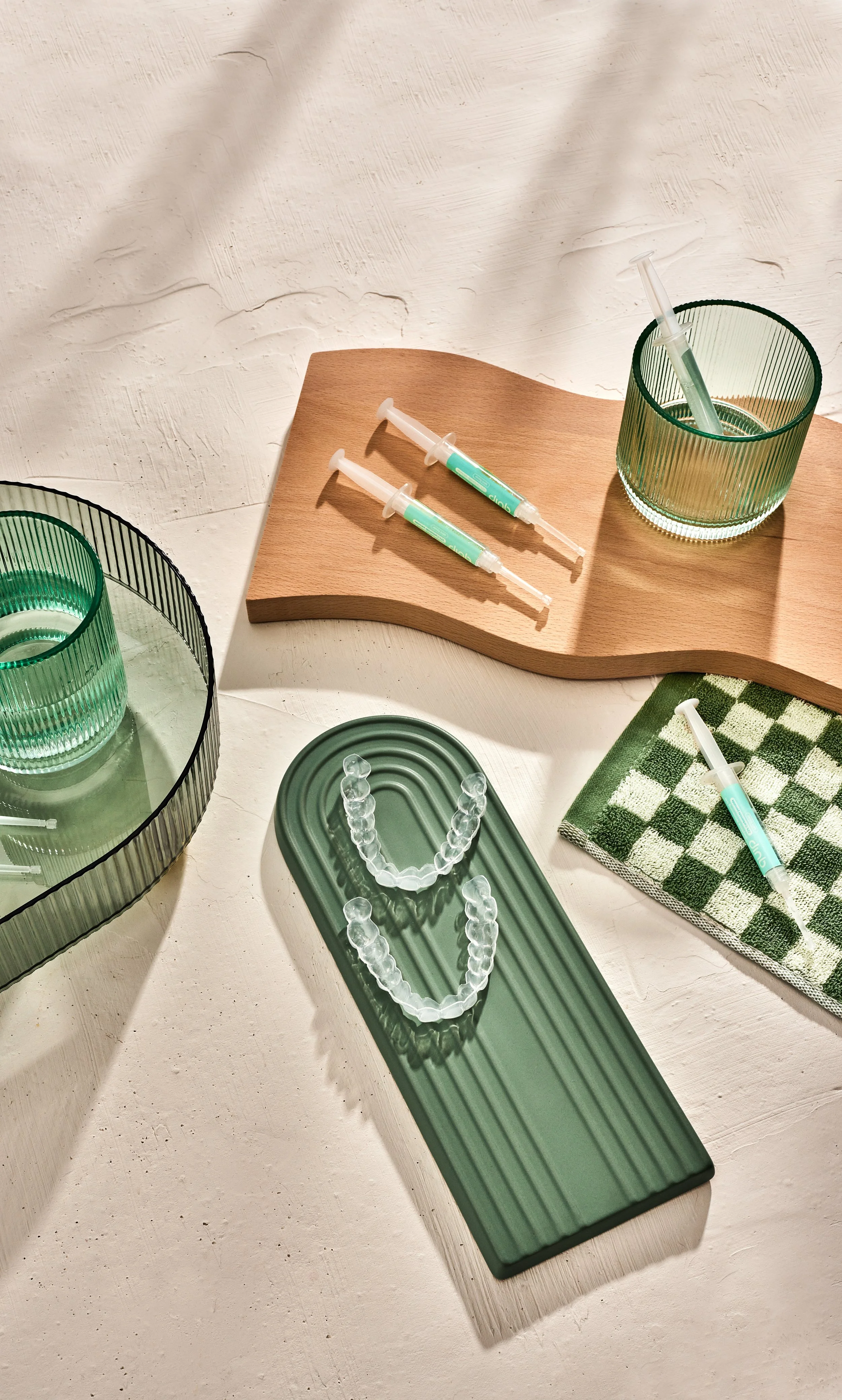
Whitening
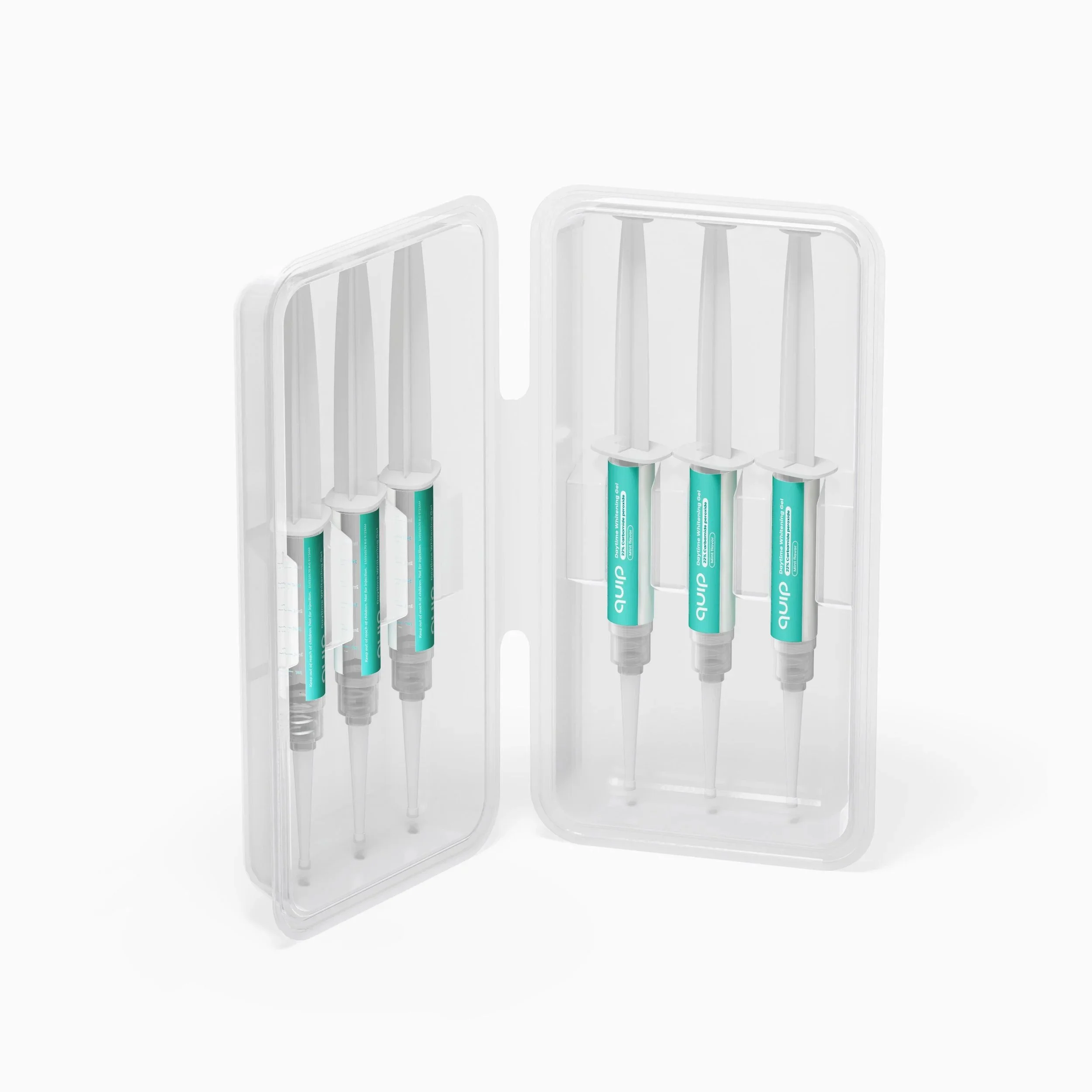
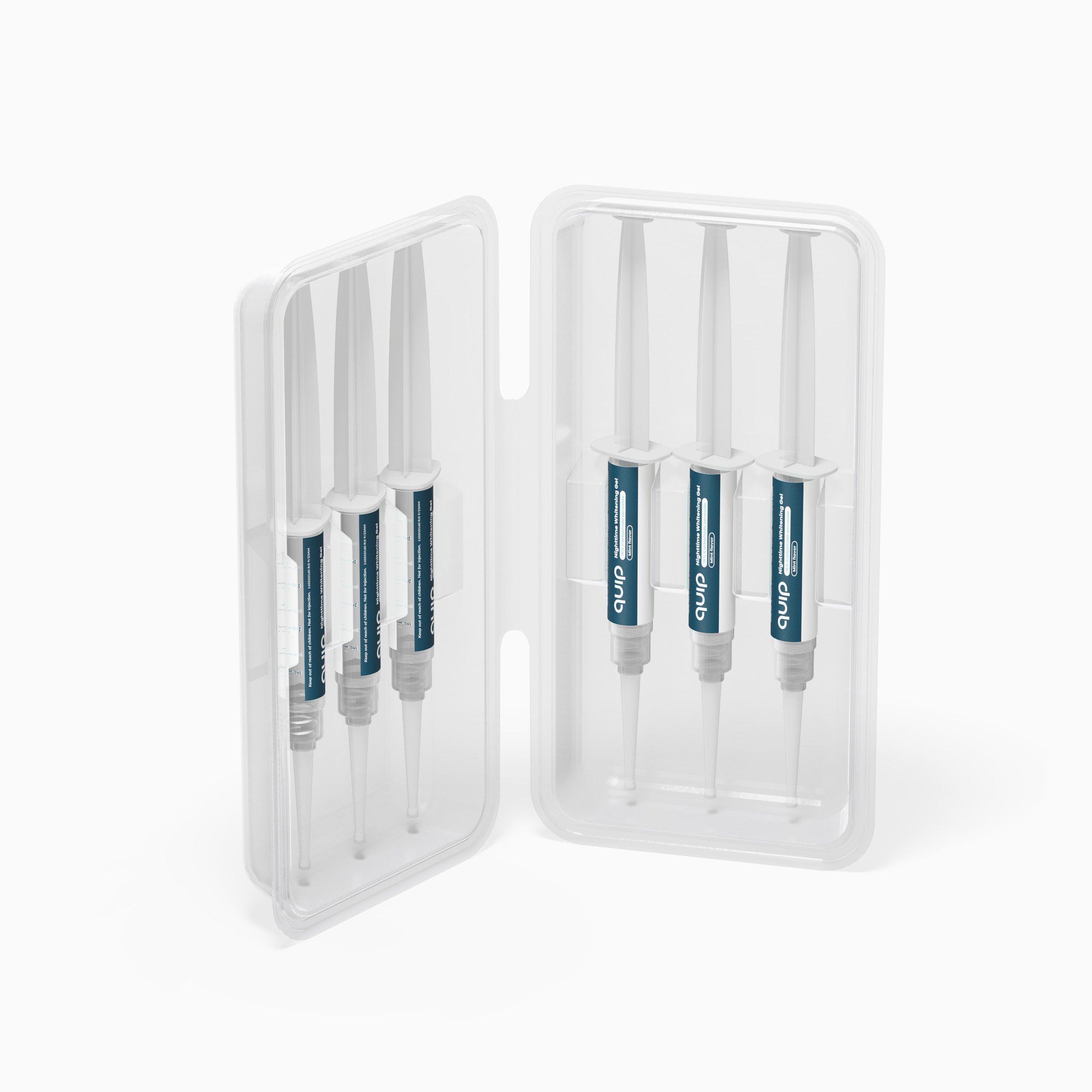
quip’s whitening kit comes in daytime and nighttime iterations, which feature different strengths of peroxide in mess-free applicators. Each applicator is labeled according to its clinical specifications, secured in a plastic shell, and placed snuggly within a box that reflects the formula’s strength. a simple, straightforward user guide directs customers through quip’s at-home whitening process. core colors and illustrations are used to strengthen quip’s newfound presence within the whitening market.

creative direction: melissa shelton
visual packaging, graphic design, and illustrations: alexandra morton