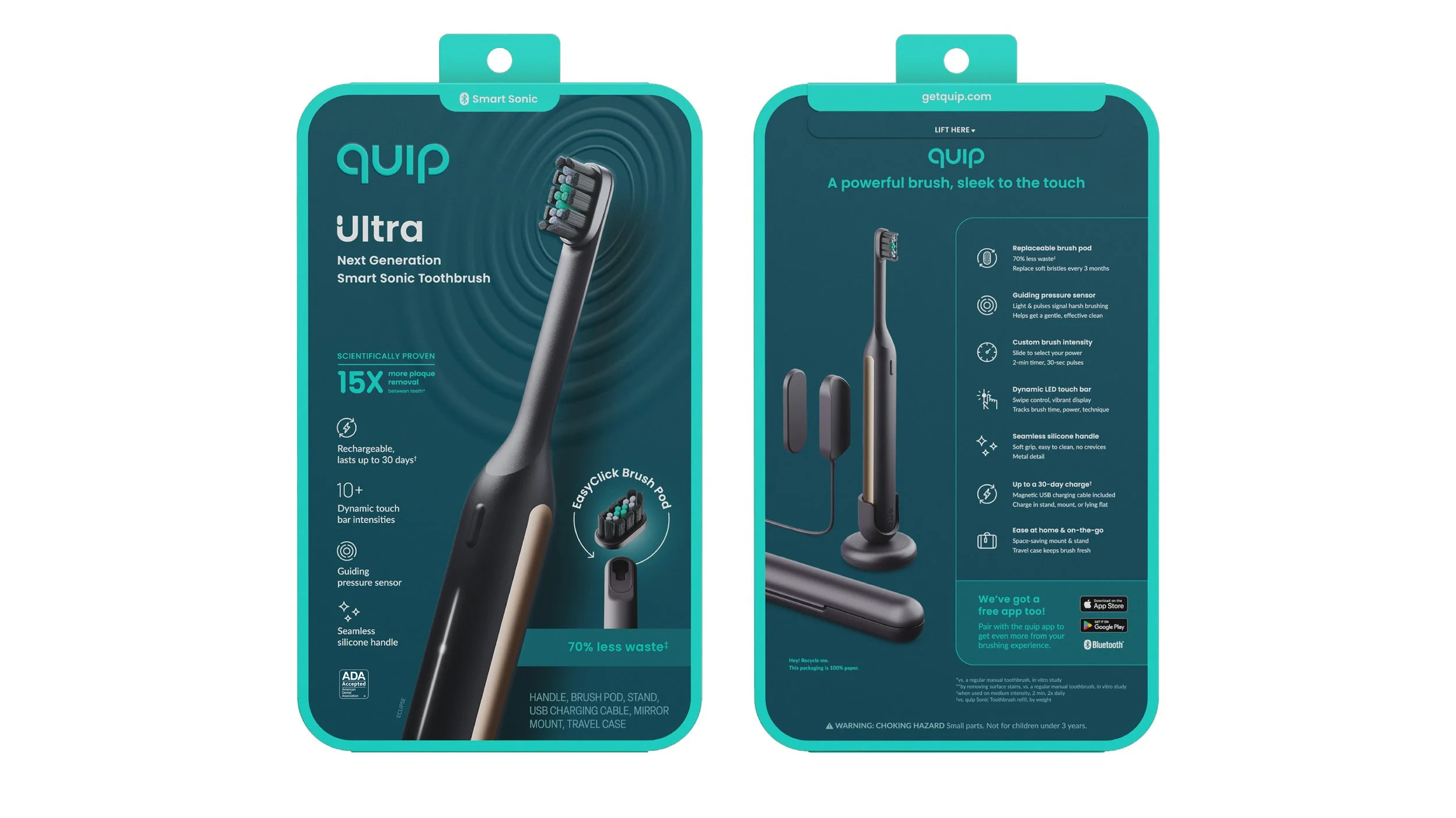
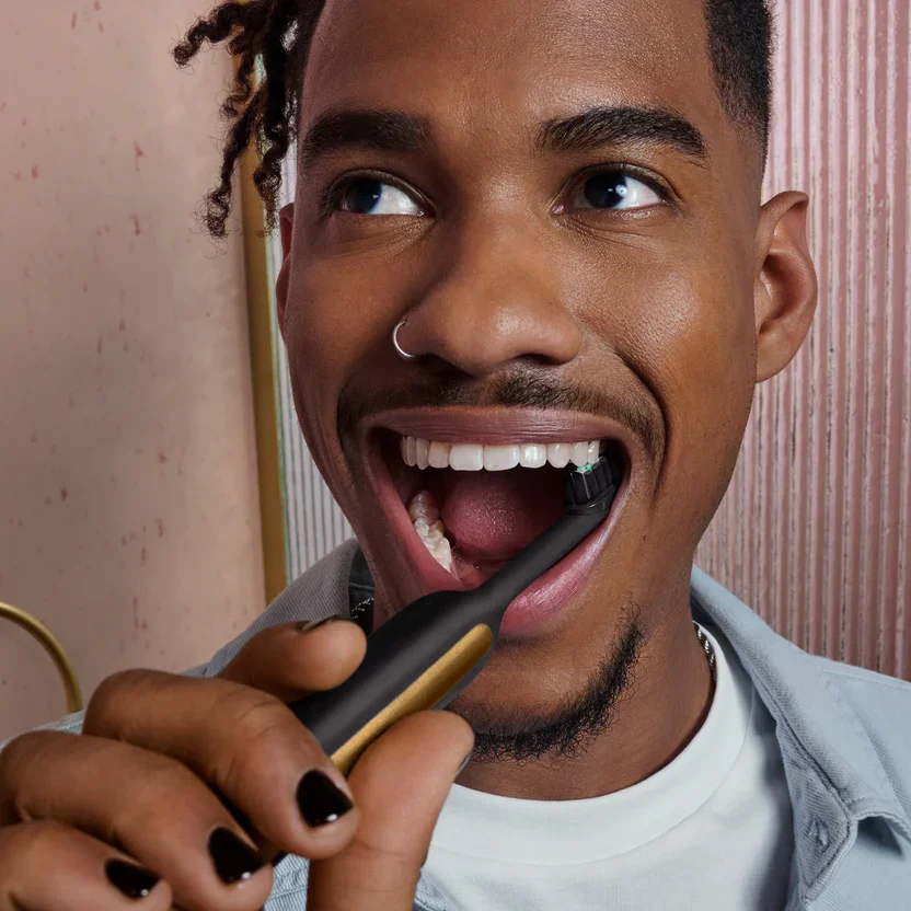
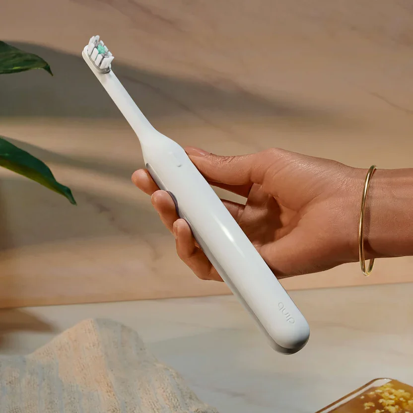
quip — Ultra Next Generation Smart Sonic Electric Toothbrush
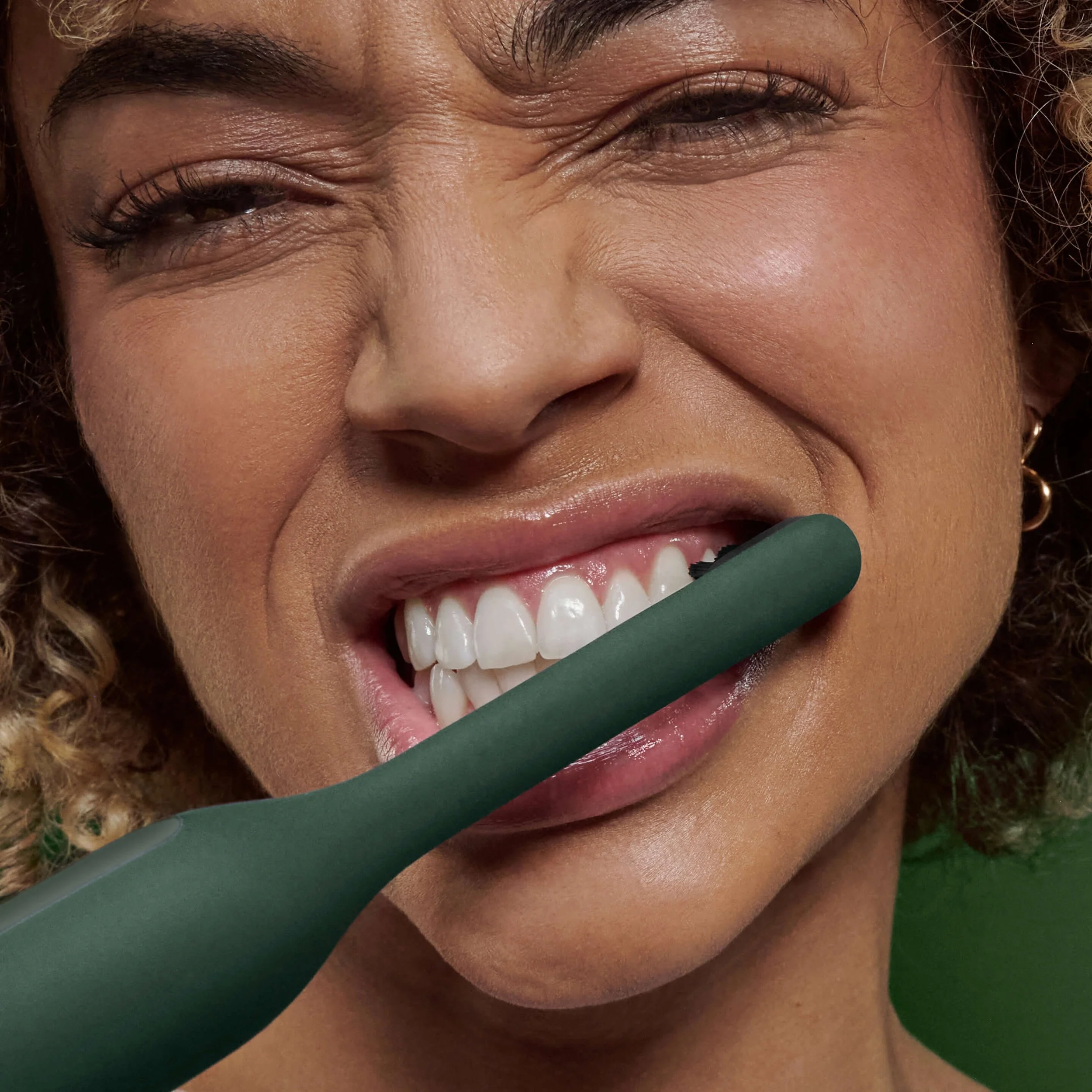
The Quip Ultra expands the company’s brush portfolio into the premium tier with innovative and sustainable features. retail packaging reflects the brush’s precise, elevated, and clinically accredited design.
visual retail packaging
01 — hierarchy
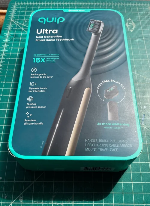
the scaling of all visual elements prioritizes key marketing touchpoints and guides customers at shelf; The front of pack neatly features the Quip logo, Ultra logo, product name, product render, key claims, core features, proprietary assets, product category, colorway, and net contents.
02 — brand reinforcement
Quip’s recognizable green border, left-aligned logo, and primary typefaces anchor ultra within the brand’s established retail system; A smart sonic identifier tab clearly defines Ultra’s placement within Quip’s brush portfolio; streamlined icons were created on quip’s underlying brand grid, highlighting core features at a glance.
03 — brand extension
deviating from quip’s usual white background, a dark flood signals ultra’s clinical credibility and premium position within the lineup.
04 — renders
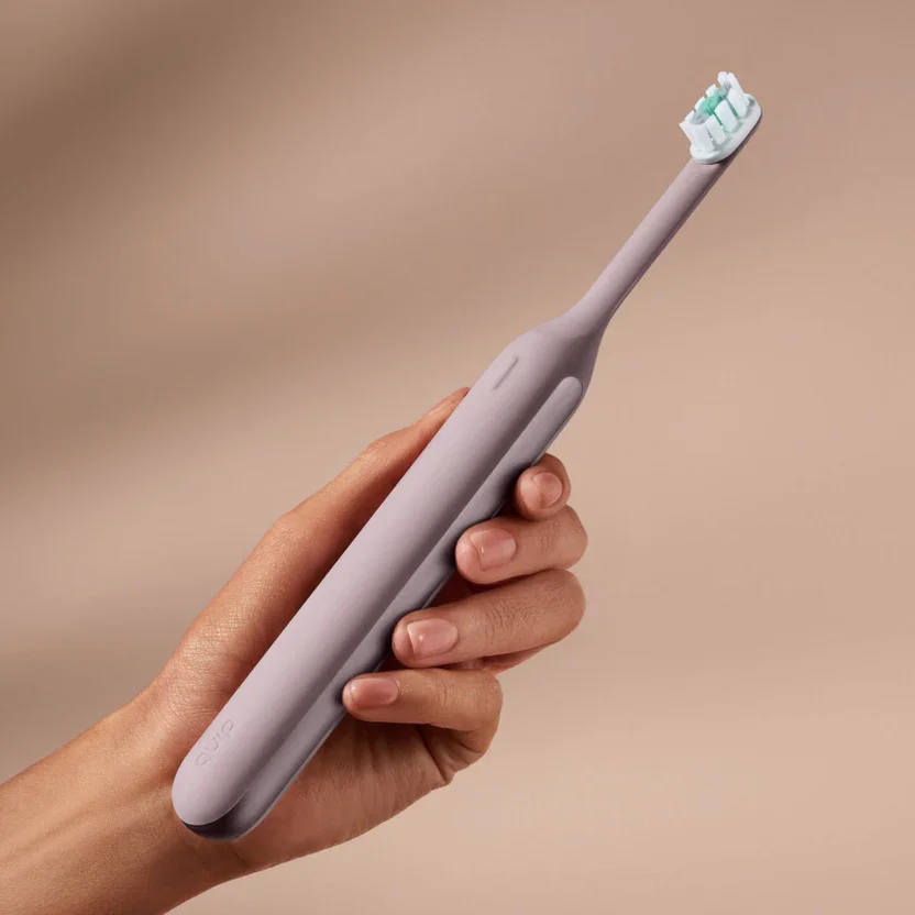
high-fidelity renders identify the product, communicate key features, and create strong visual impact.
05 — technique
a circular, debossed motif mimics ultra’s sonic vibrations and establishes a focal point around the brush.
06 — call-outs
A prominent badge explains ultra’s proprietary brush head function, emphasizes sustainability, and reinforces product differentiation.
07 — engagement
back of pack expounds upon key benefits, demonstrates accessory function, and encourages participation with quip’s brushing app.
08 — compliance
Net contents, legal warnings, disclaimers, and ada seals are designed in full compliance with industry standards.
structural retail packaging
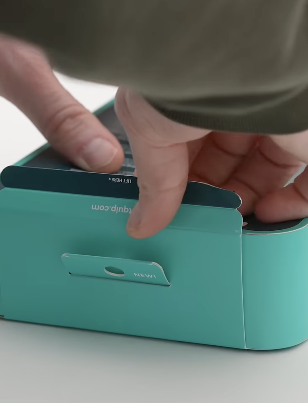
01 — intrigue
A debossed, dimensional ripple on the outer surface of the packaging demonstrates that ultra uses sonic vibrations to clean teeth. this texture is tactile and dynamic on shelf under retail lighting.
02 — simplicity
The cover of the outer carton is used to seal the top of the package, creating a sleek appearance, reducing steps at pack-out, and lowering costs.
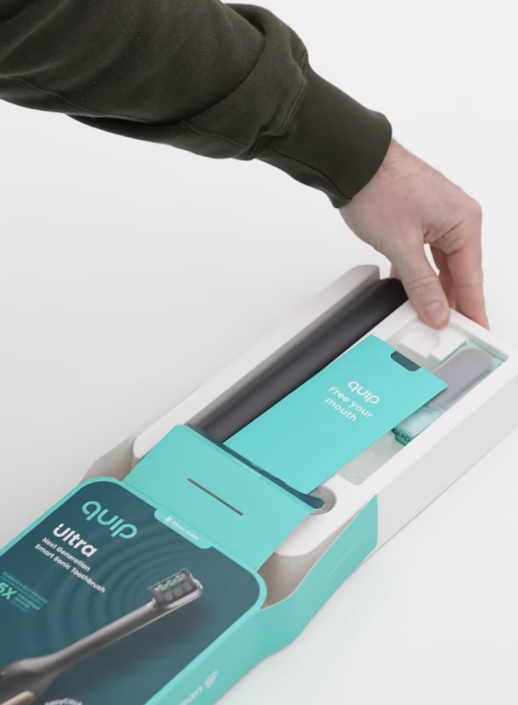
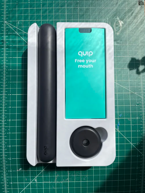
03 — ease
upon opening the outer carton, a single molded fiber tray slides out. no fiddling! finger notches are present on the envelope for easy access to the user guide. a finger notch is also included next to the brush’s circular base. no need to flip the tray upside or struggle to remove it. the brush itself is easily removed from either end of the tray.
04 — intuition
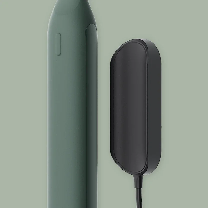
ultra’s tray structure showcases the brush and its components in optimal order, guiding the user experience: brush in case, welcome pamphlet, a proprietary stand accessory, and finally, beneath the pamphlet, standard items like ultra’s charging cable.
organic social

creative direction: melissa shelton
visual packaging and graphic design: alexandra morton
structural packaging: sean wilson, jon fratti, and alexandra morton
product renders: sample studio la
product design: louis filosa and jon fratti
process photography: jon fratti
organic social video courtesy of Talmesha keonna