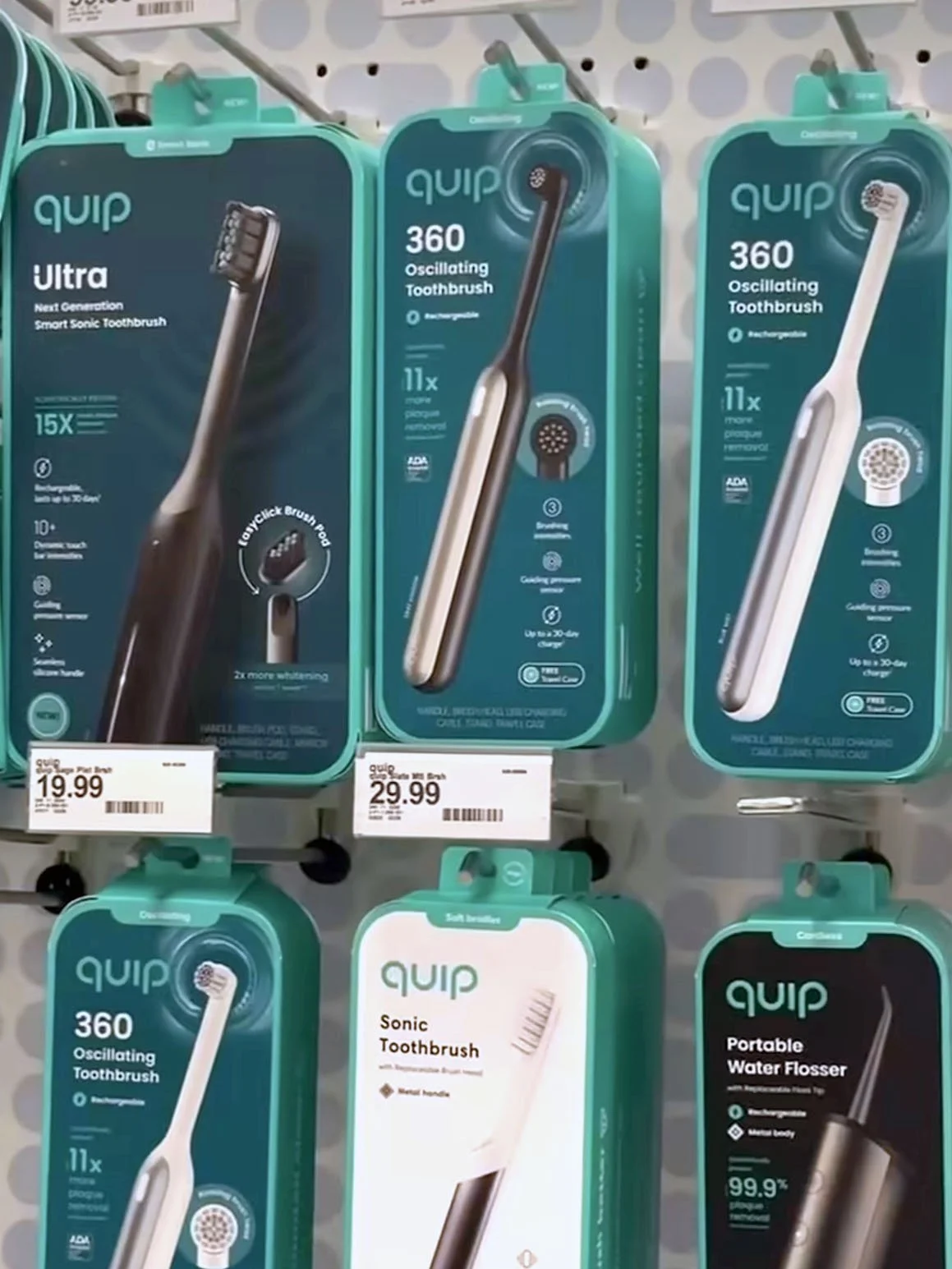
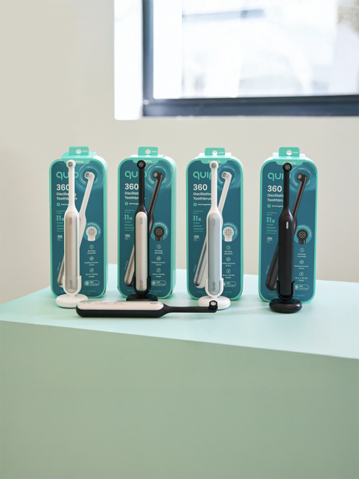
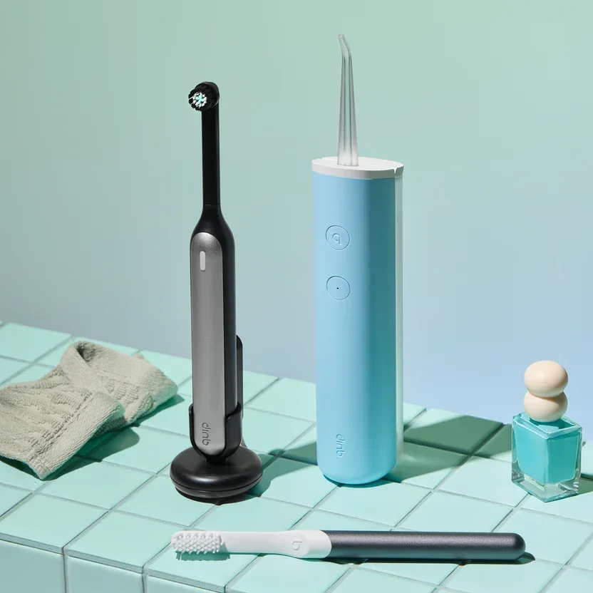
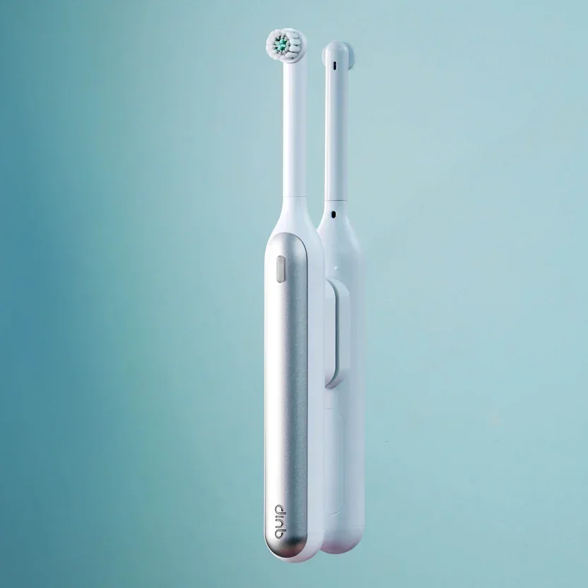
quip — 360 Oscillating Toothbrush retail packaging
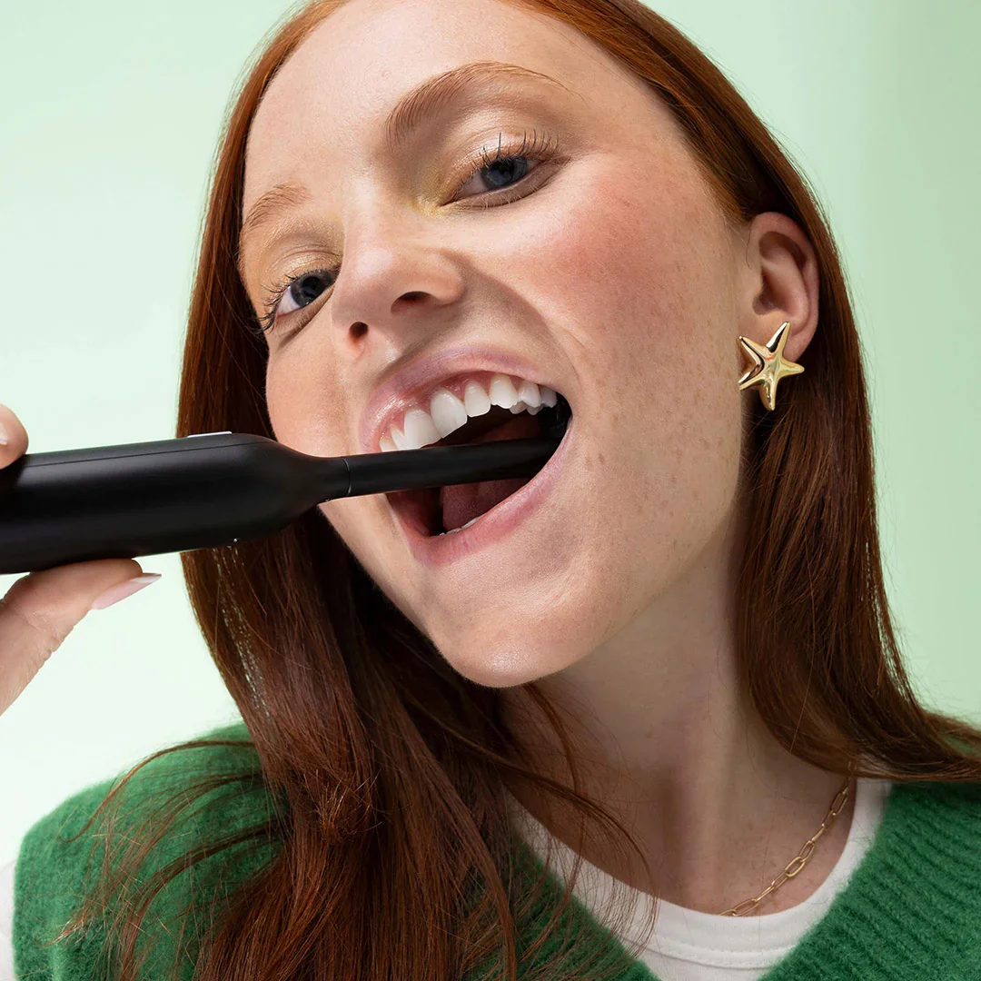
360 is quip’s first new electric toothbrush since the release of its original sonic brush. It offers high-end features at a reasonable price in the oscillating toothbrush category. retail packaging addresses this shift by extending and elevating quip’s visual language through pivotal changes to color, typography, renders, composition, and the unboxing experience.
visual retail packaging
01 — Brand reinforcement
The product category is immediately established through Quip’s tab system at the top of pack, while the brand’s signature green border places 360 firmly within quip’s broader ecosystem. A left-aligned logo, product name, and “rechargeable” designation further defines the product and represents quip’s established brand architecture.
02 — brand extension
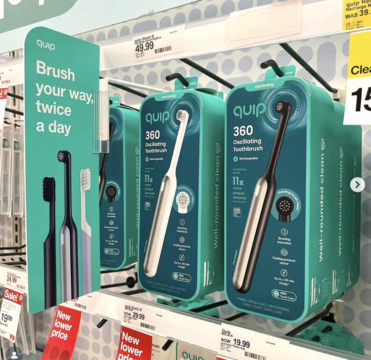
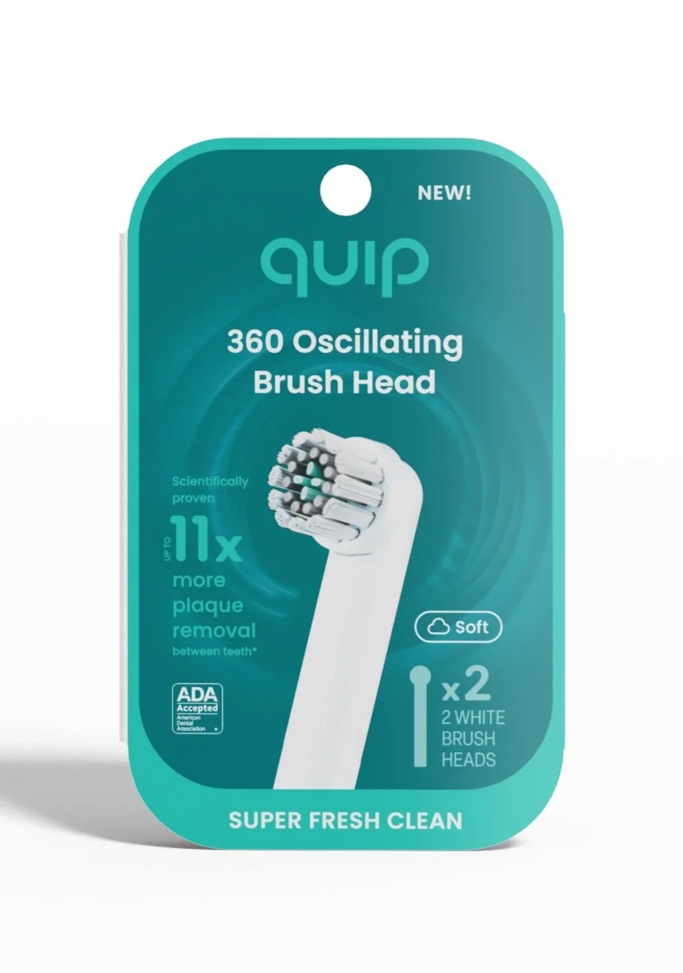
For the first time, a dedicated product logo is introduced and scaled for strong shelf visibility. the logo’s Rounded corners reference the brush’s approachable price point, circular brush head, and oscillating motion. Quip’s brand language expands with a full-color background, differentiating 360 from the brand’s sonic brushes that feature simpler, white packaging. The blue-green flood signals Quip’s newfound ownership of more advanced, high-end products. Notably, the “next in line” Ultra brush features an even darker background treatment, reinforcing its position as the most elevated offering in quip’s lineup.
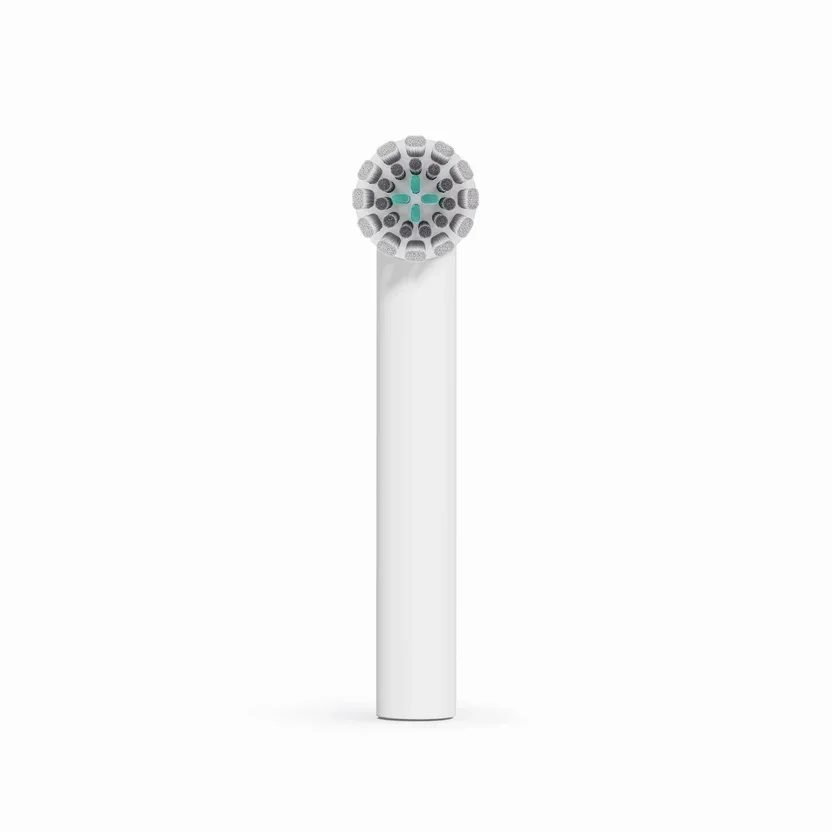
03 — renders
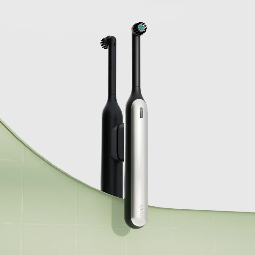
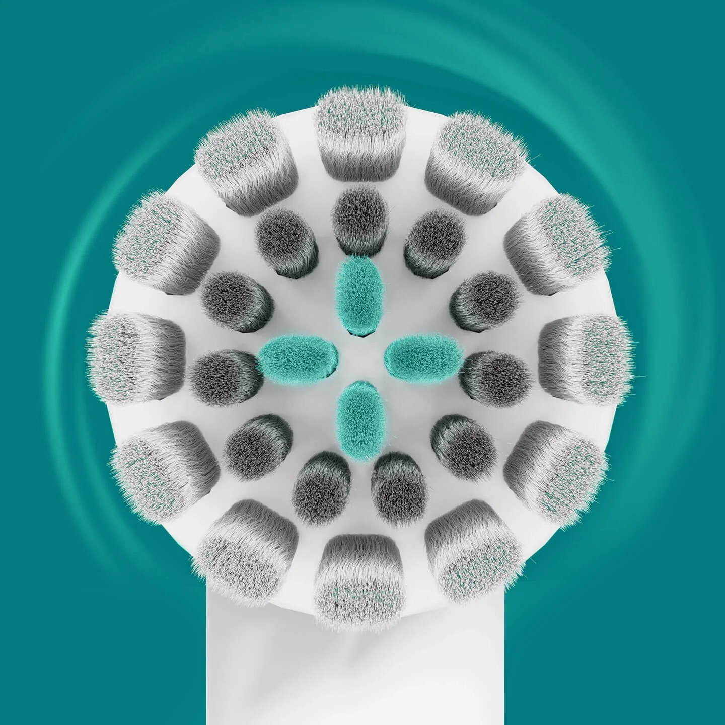
A high-quality product render of the brush is prominent on front of pack. it maintains consistent scale and proportion with brushes on all of quip’s packaging. Surrounding the brush, a dynamic spinning render conveys oscillation and competes with similar action cues used across the category. on the back of pack, additional renders explain 360’s full in-box product offering.
04 — claims and credentials
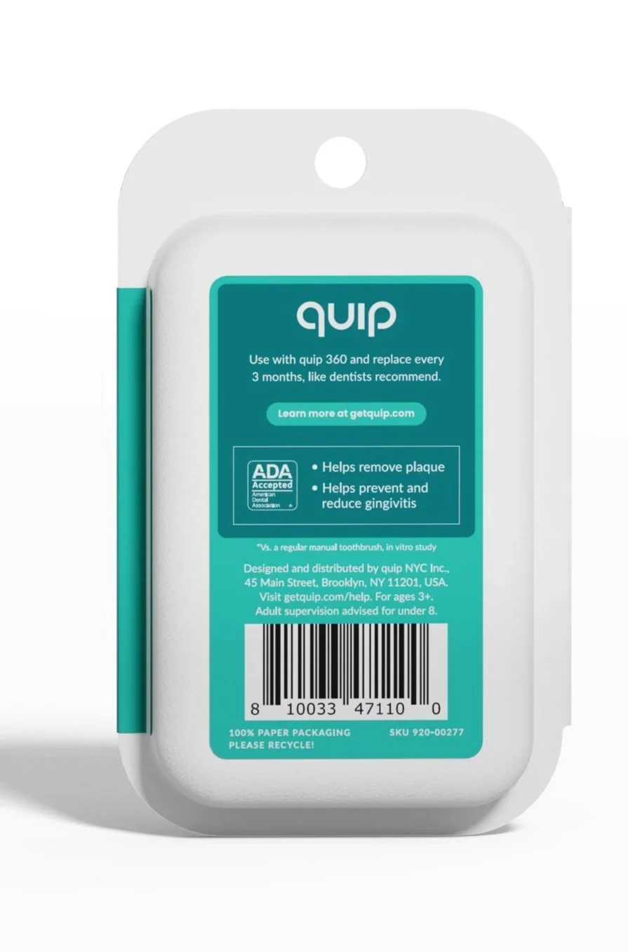
Accredited marketing claims sit below the product name, followed by quip’s ADA certification. the brand’s entry into the oscillating market is reiterated with a badge on the right side of pack, emphasizing rotational movement rather than sonic vibration. key product features are clearly communicated with streamlined icons. on the back of pack, additional icons further expound upon the brush’s core strengths.
05 — engagement
on back of pack, quip’s app is easily accessible with a qr code, encouraging users to connect with the brand’s reward program.
06 — compliance
Net contents, legal warnings, disclaimers, and ada seals are designed in full compliance with industry standards.

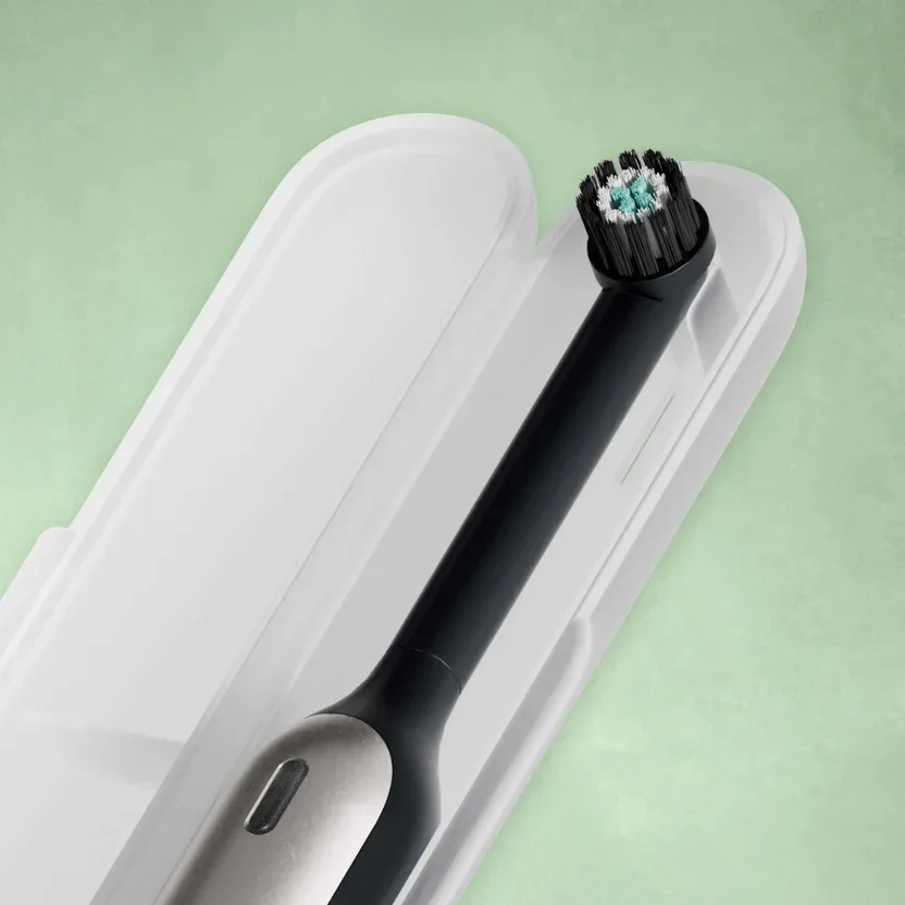
structural retail packaging
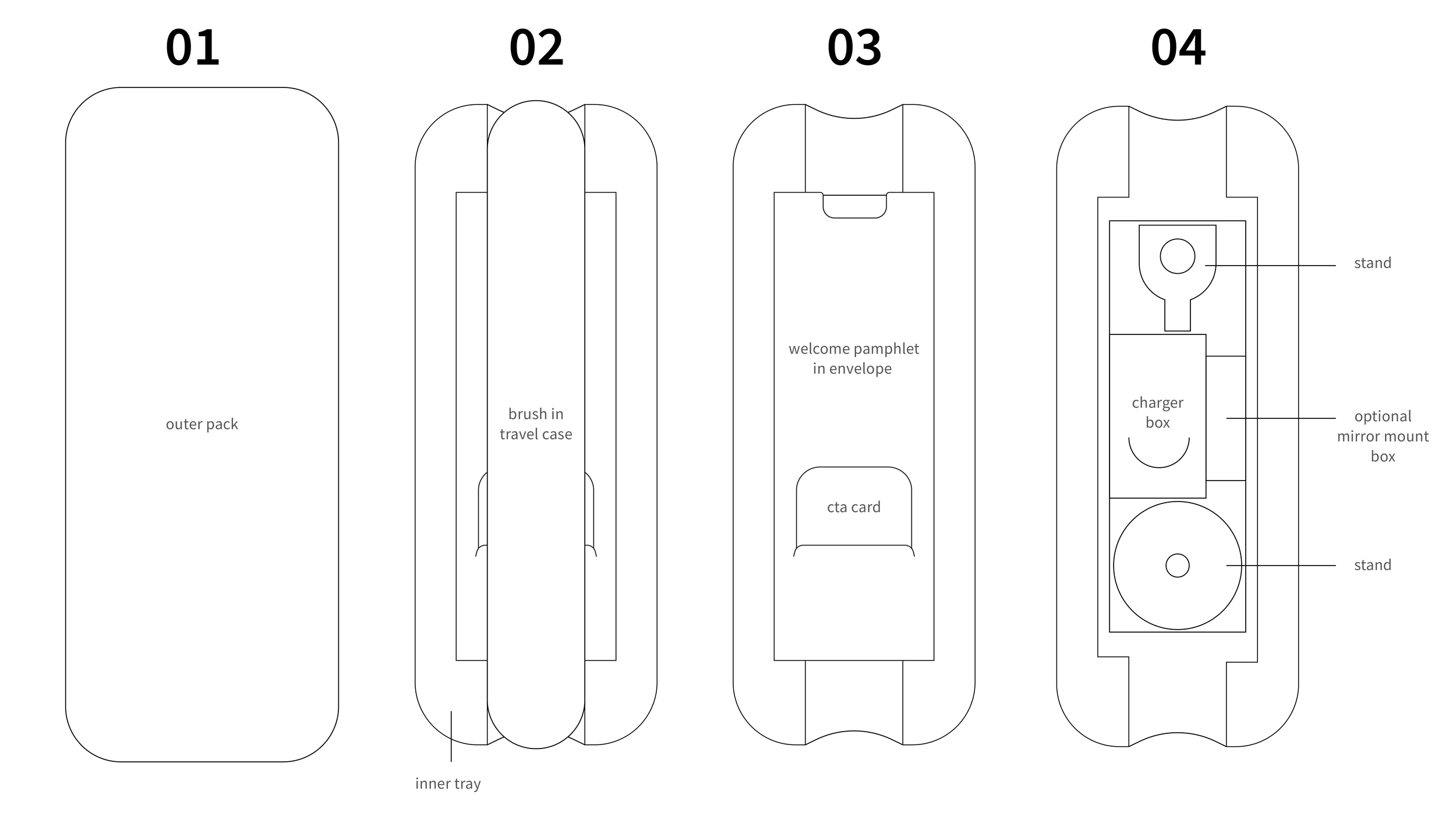
01 — tray
Like all Quip brushes, 360 sits in an easy, slide-out pulp tray.
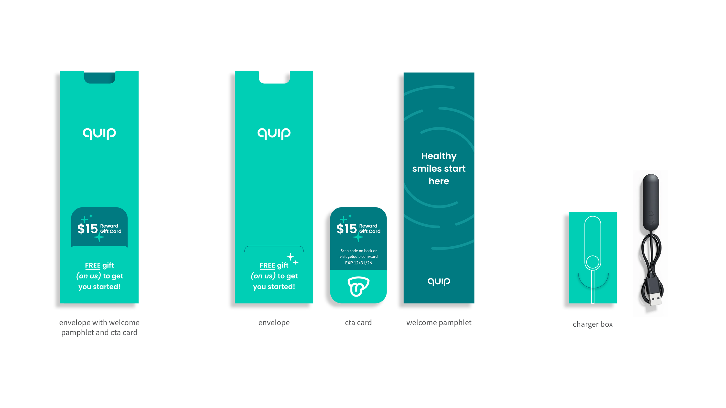
02 — engagement assets
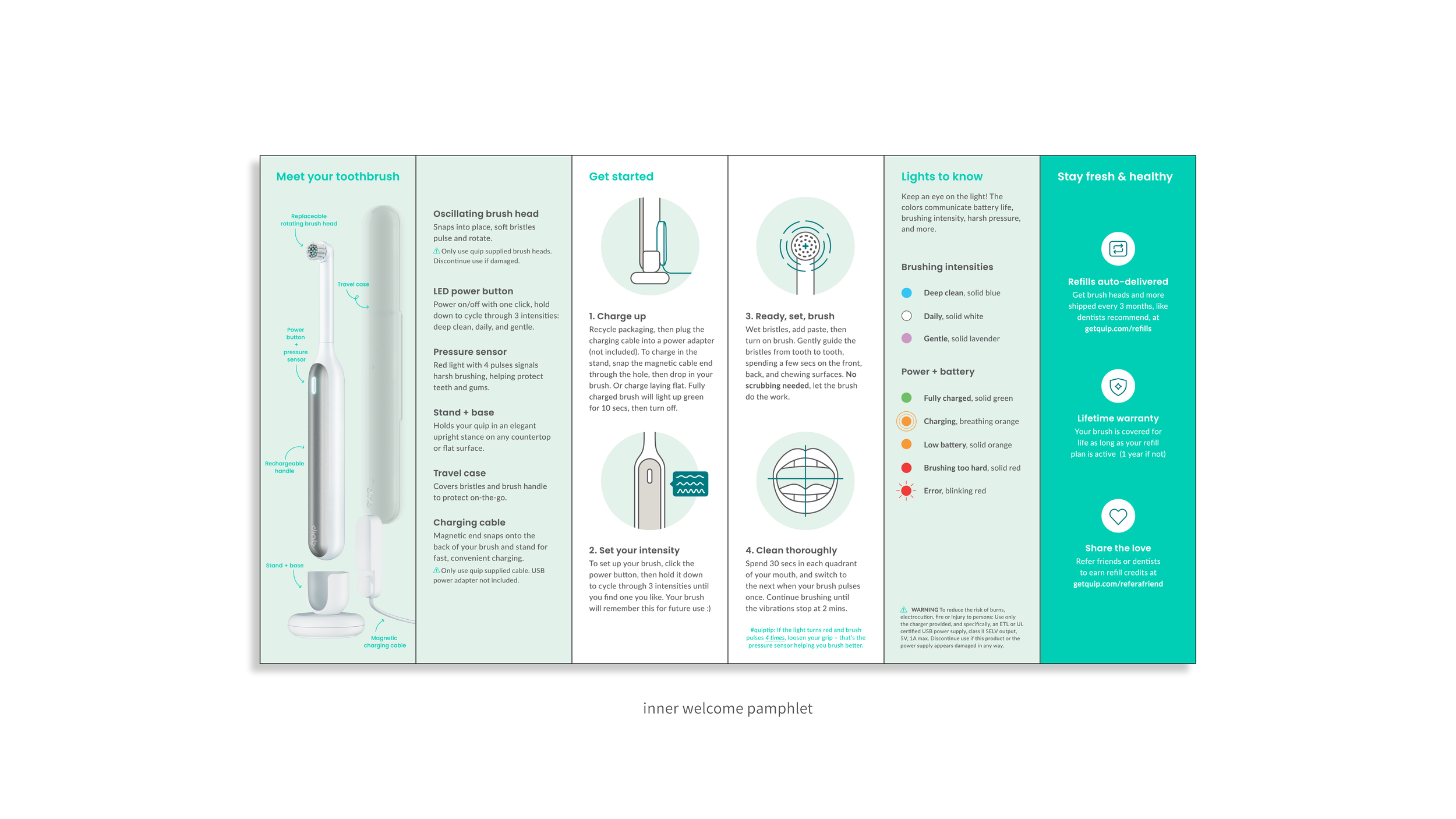
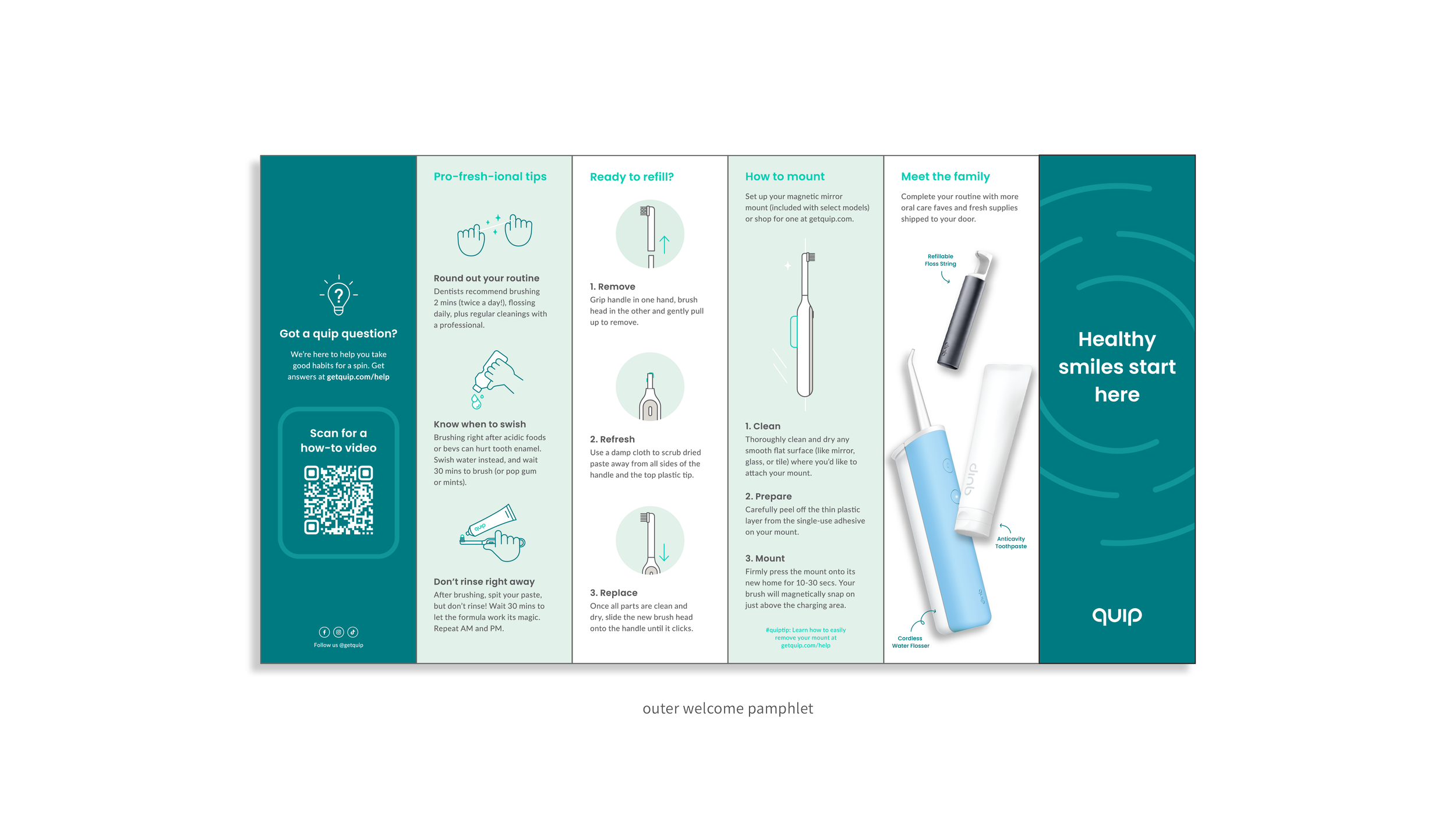
users are greeted by a welcome pamphlet in an envelope, centered to encourage customer education. A CTA card is tucked neatly within to promote cross-channel interaction with other brand products.
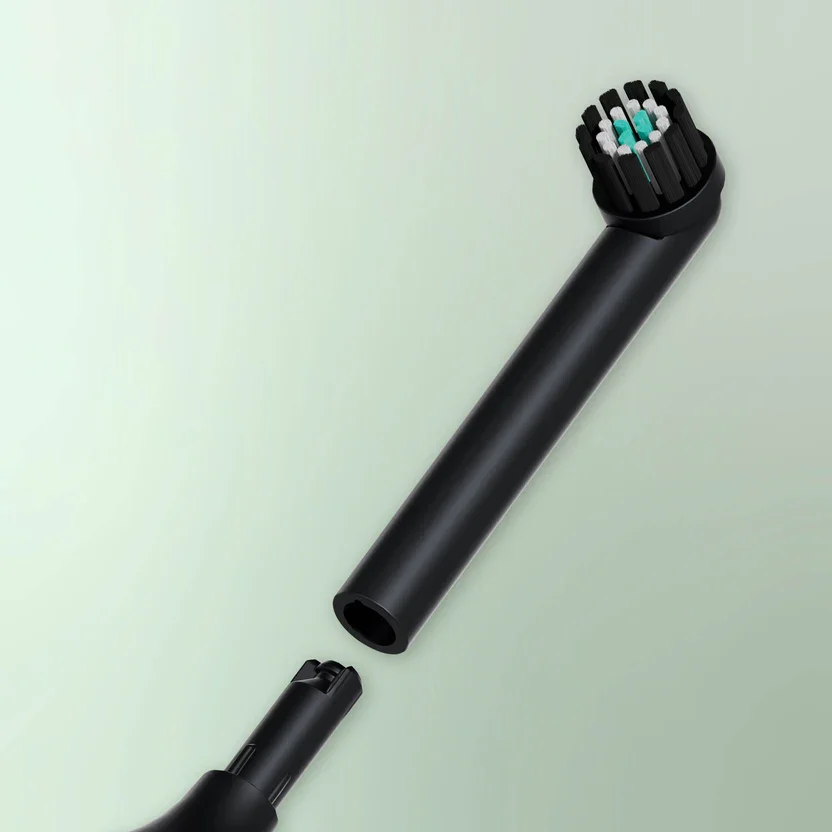
03 — product
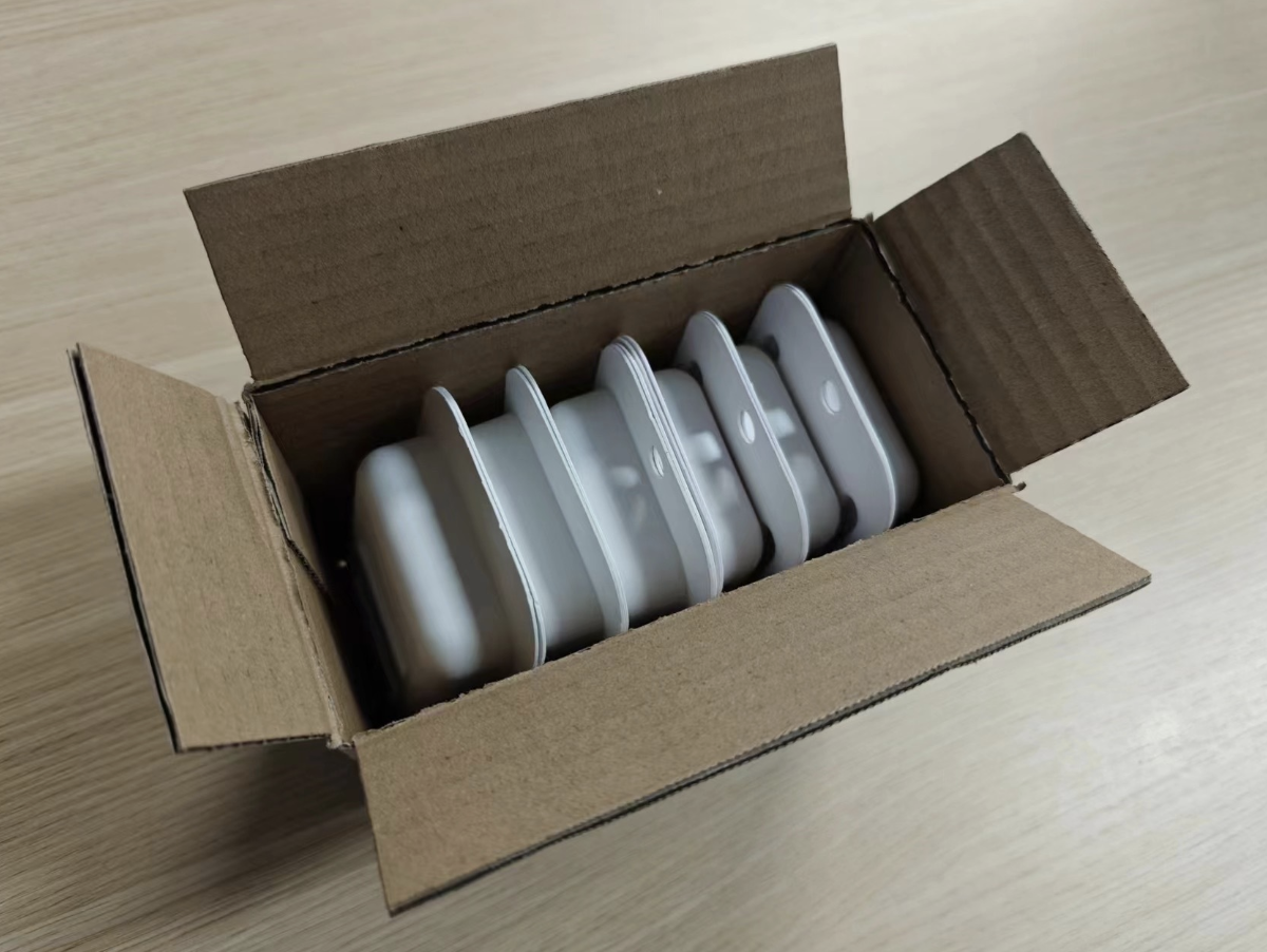
The brush is securely housed within its travel case. Beneath the welcome pamphlet, additional accessories are neatly organized and easy to access. A finger notch on the charger box allows for smooth removal of all additional in-box elements. The tray is also designed to accommodate a mirror mount, included in select 360 retail deals, enabling multiple product configurations without the need for multiple tray iterations.
Refill retail packaging
01 — cost reduction
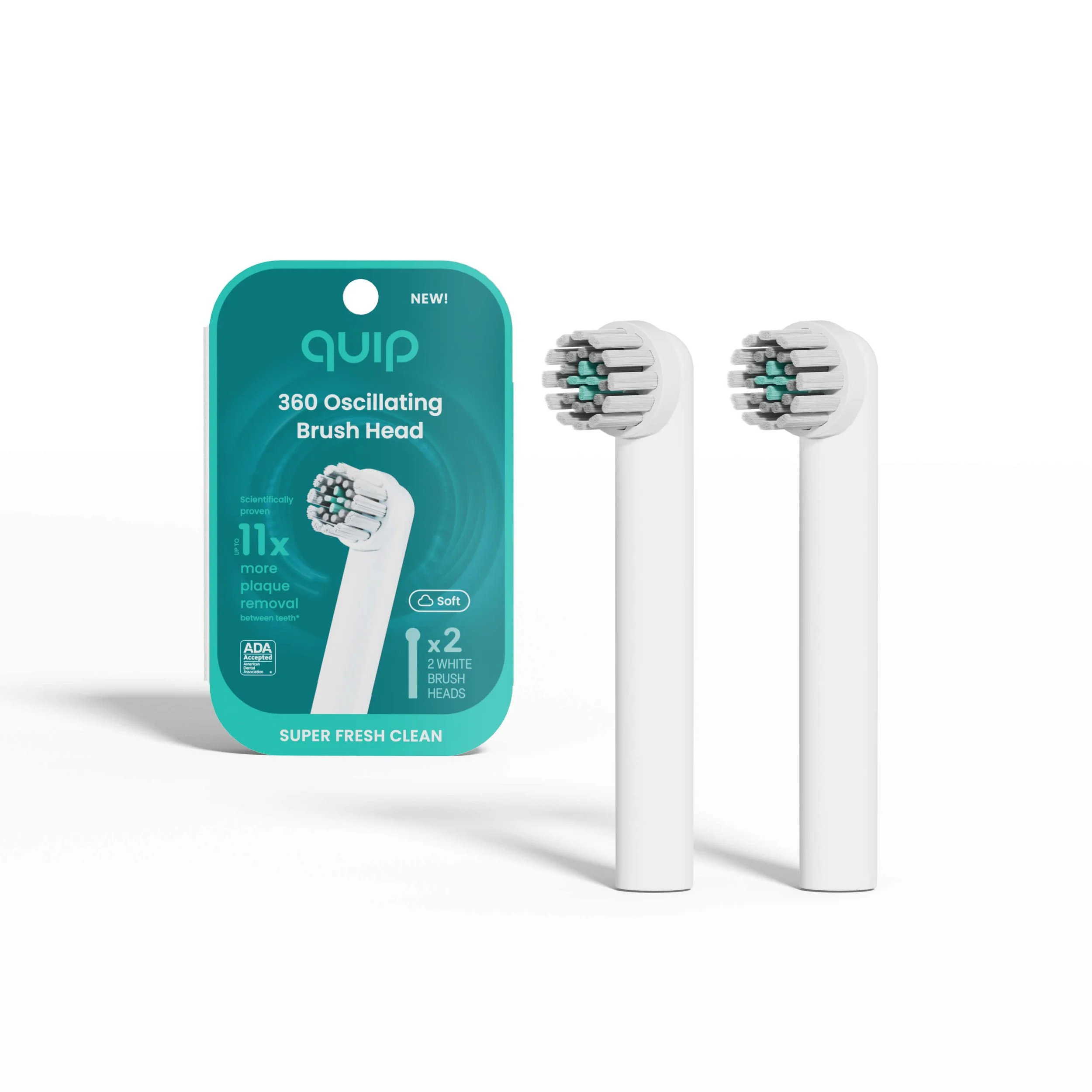
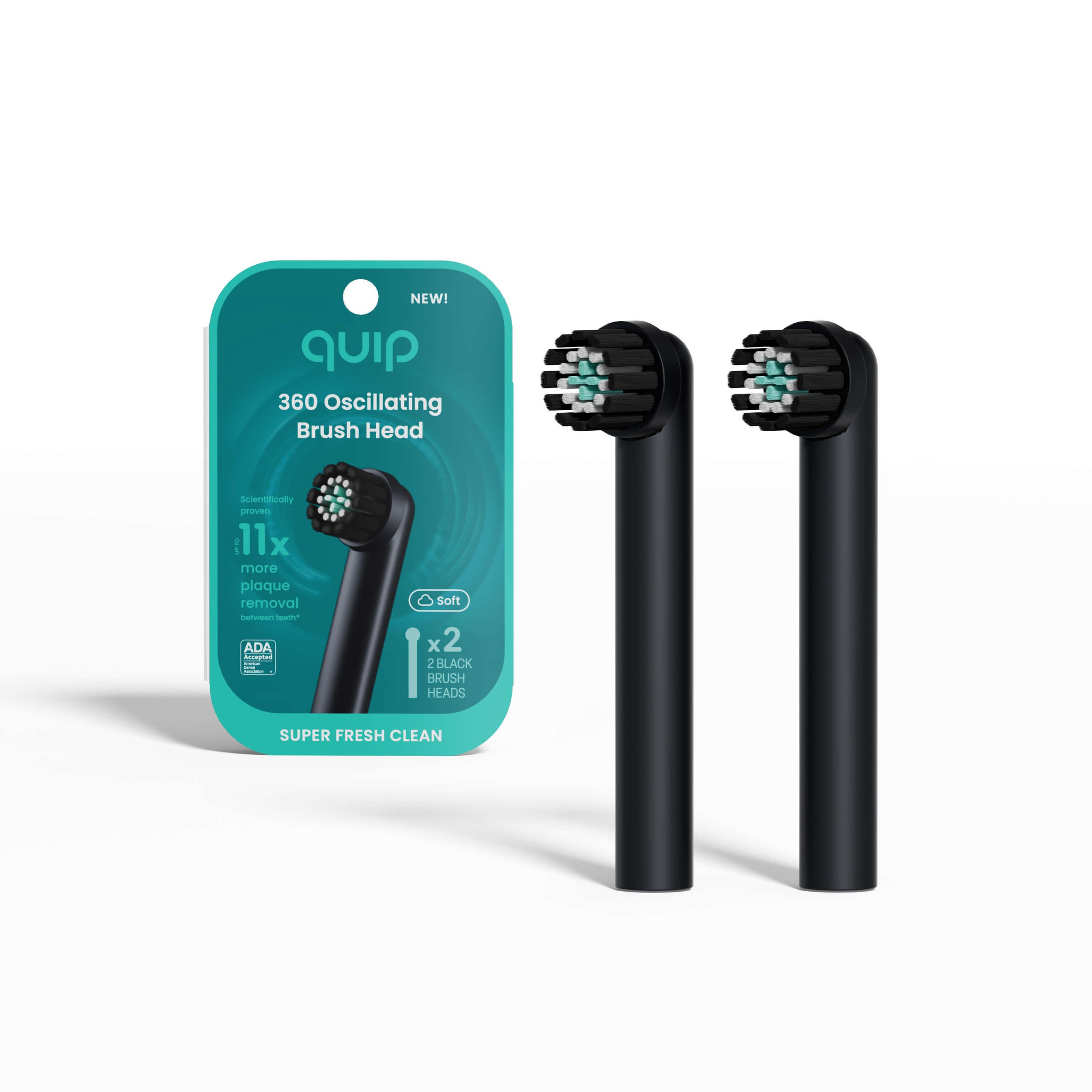
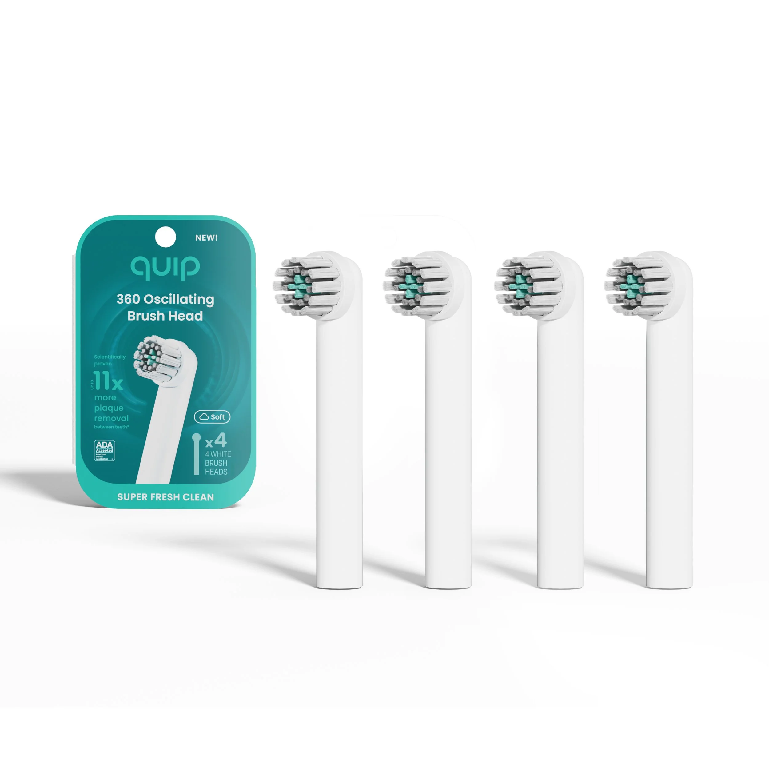
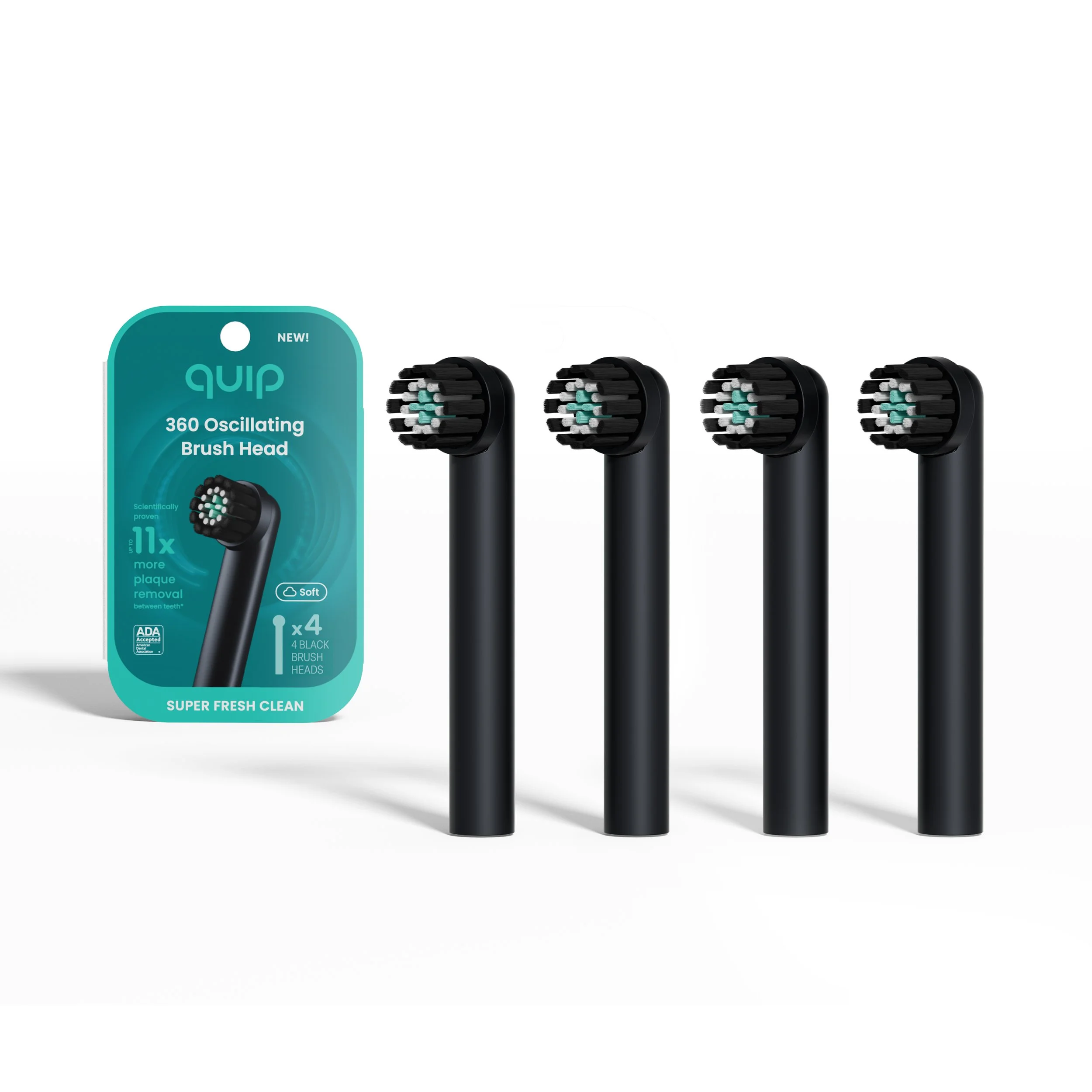
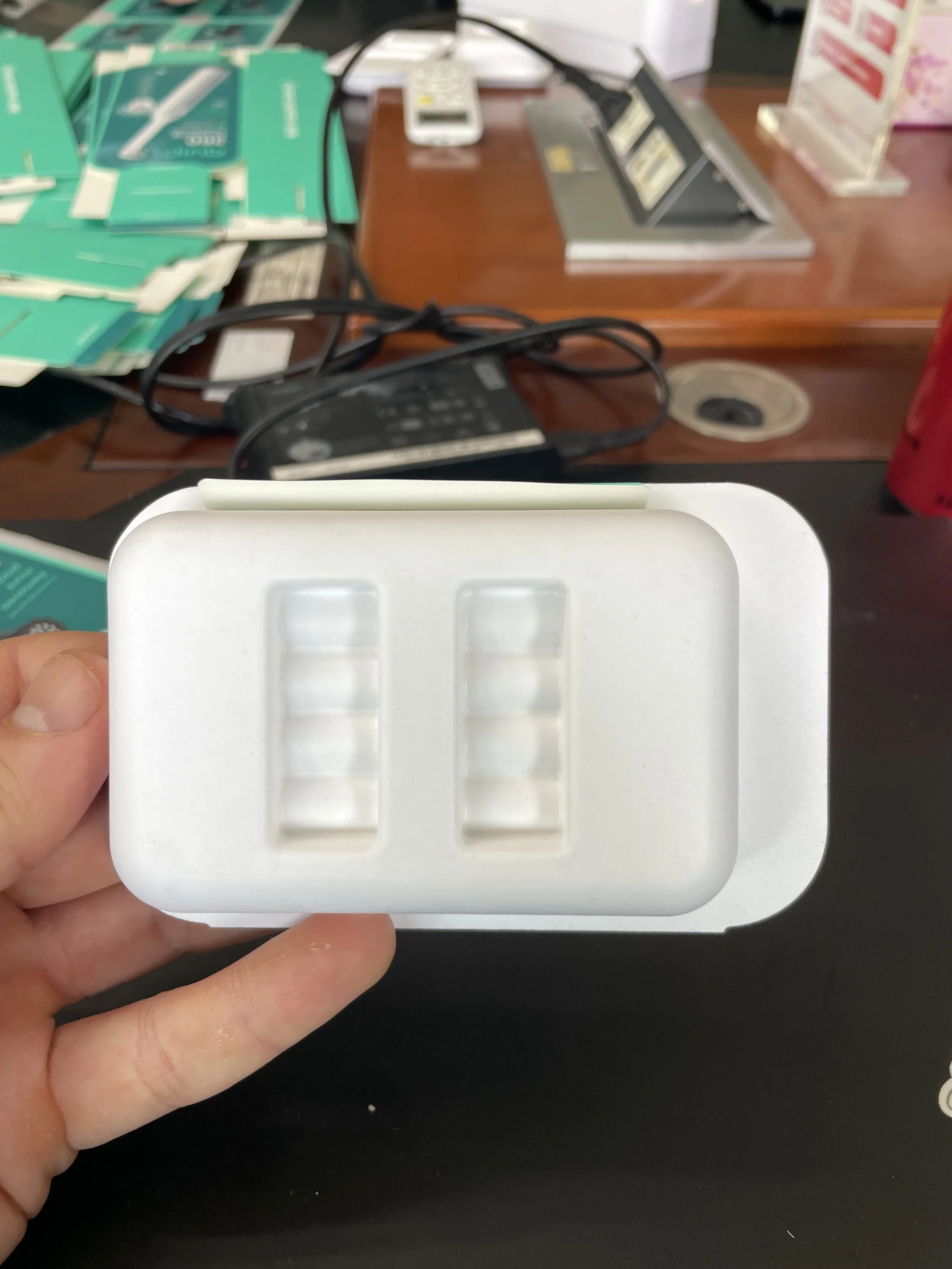
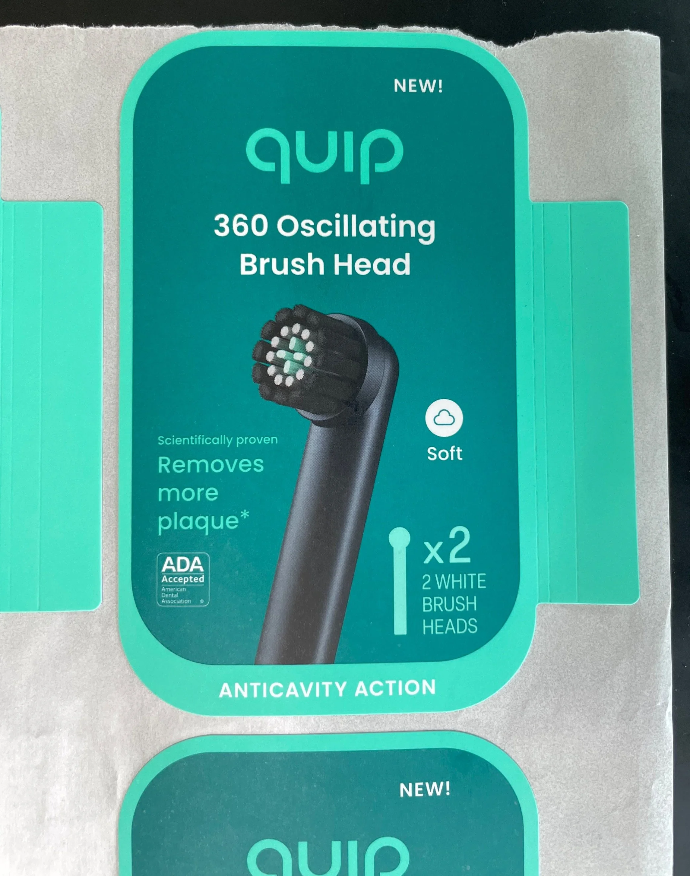
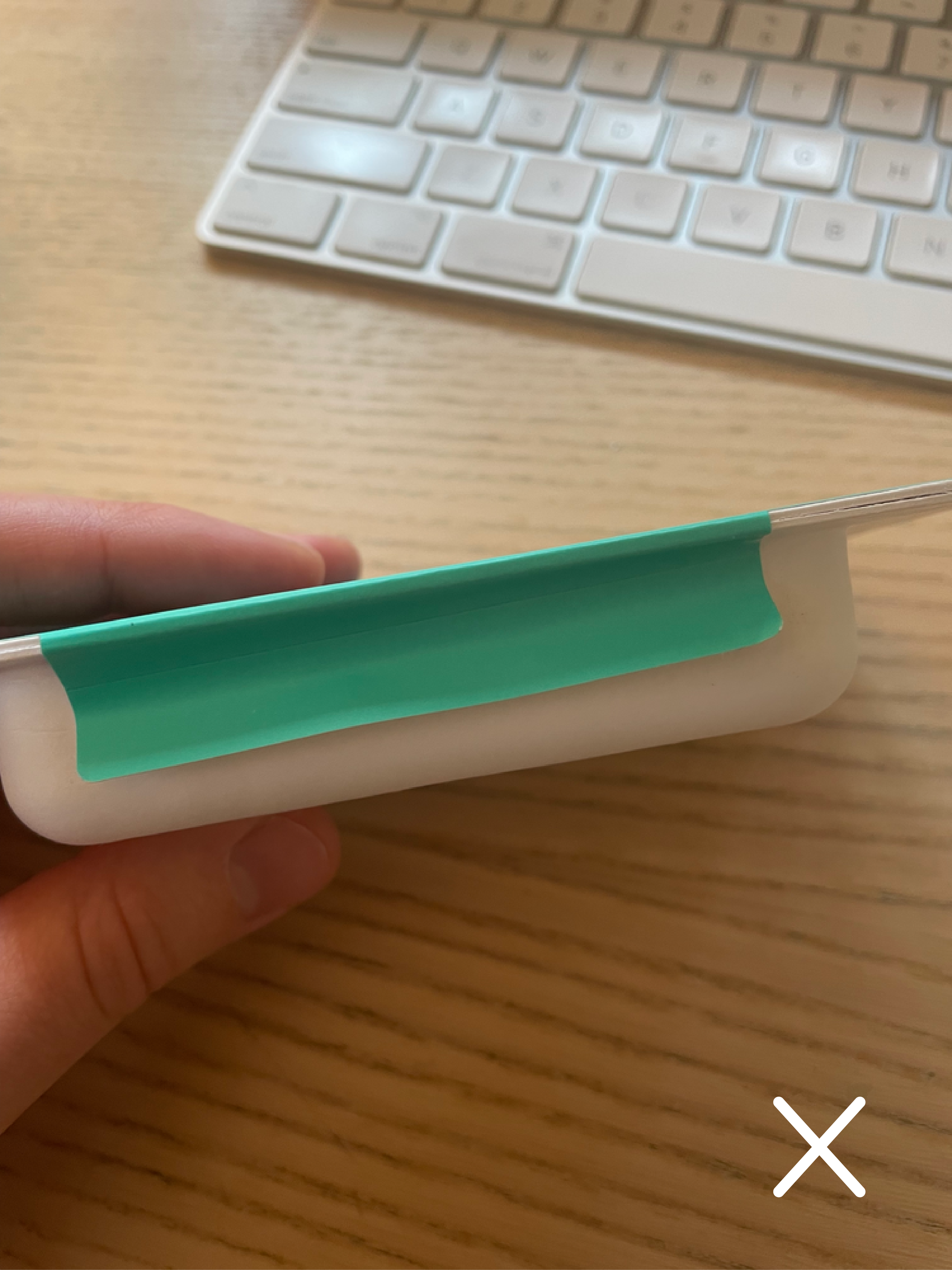
quip’s 360 brush head refill packs present a cost-effective way to sell brush head replacements. to further reduce costs, a single-hinged, molded tray was built to hold 2-4 brush heads. the front sticker extends beyond the edge of the tray and doubles as a secure pack closure.
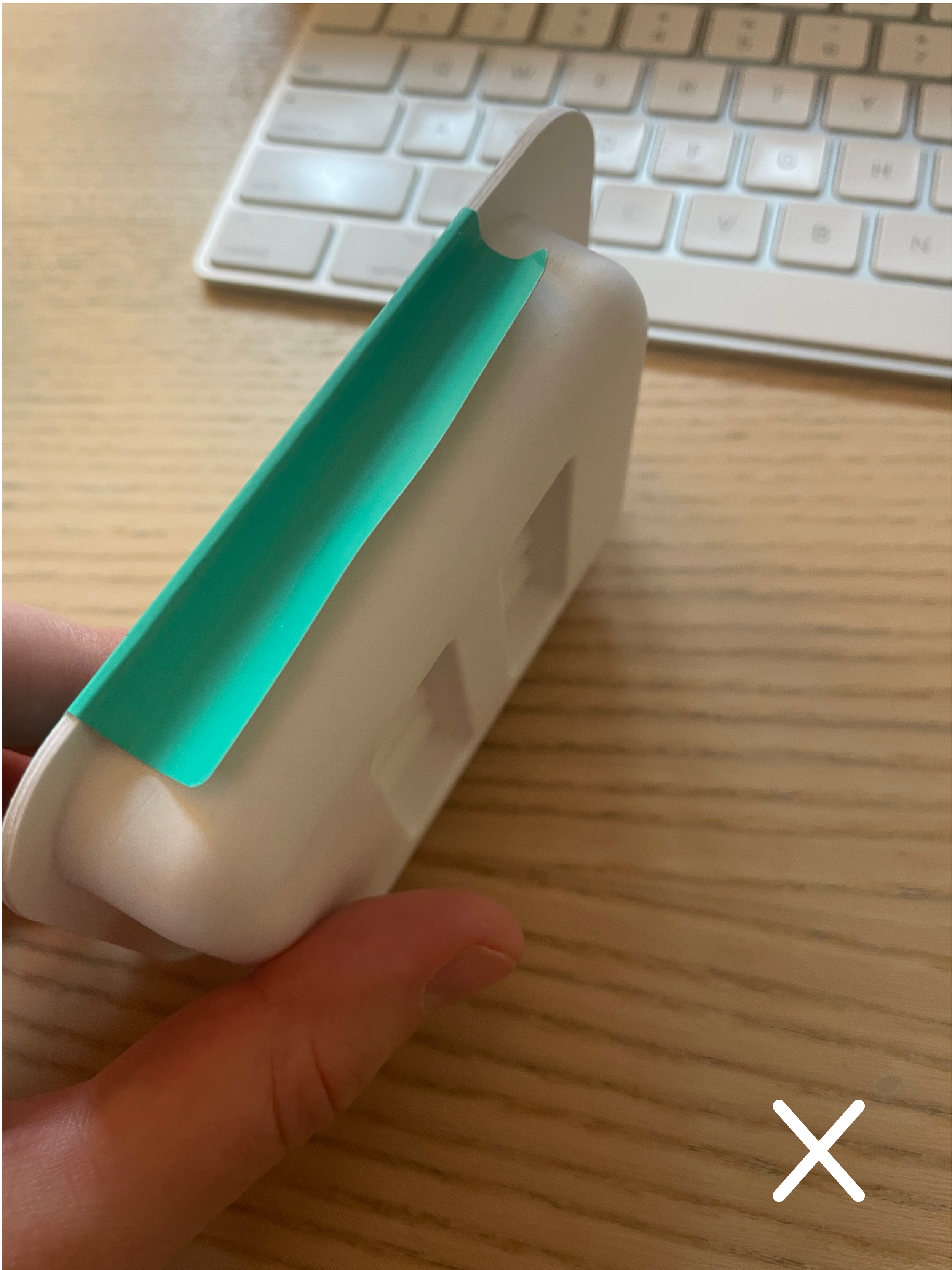
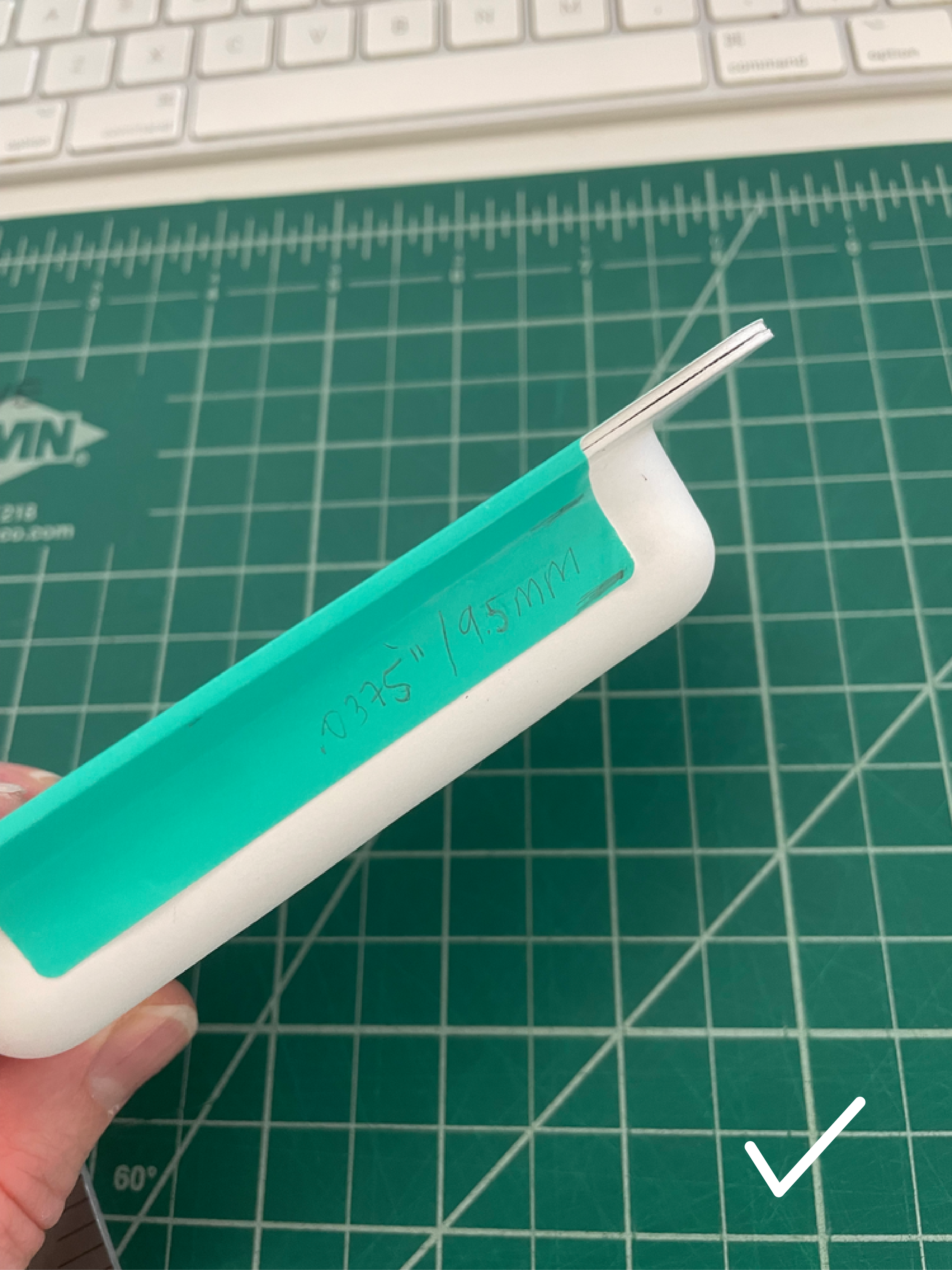
02 — troubleshooting
unable to print directly on the tray itself, packaging instead relies on front and back stickers for all brand visuals.
03 — quality
multiple adhesives were tested to ensure that the extended front sticker (and security device) stays closed on shelf, but does not compromise the customer’s unboxing experience (see below). despite substrate restrictions and a unique build, quip’s 360 brush head refills feature 360’s primary retail branding.
quip’s 360 dtc, amazon, and provider packaging is available upon request
creative direction: melissa shelton
visual packaging and graphic design: alexandra morton
structural packaging: sean wilson, jon fratti, and alexandra morton
product design: louis filosa and jon fratti