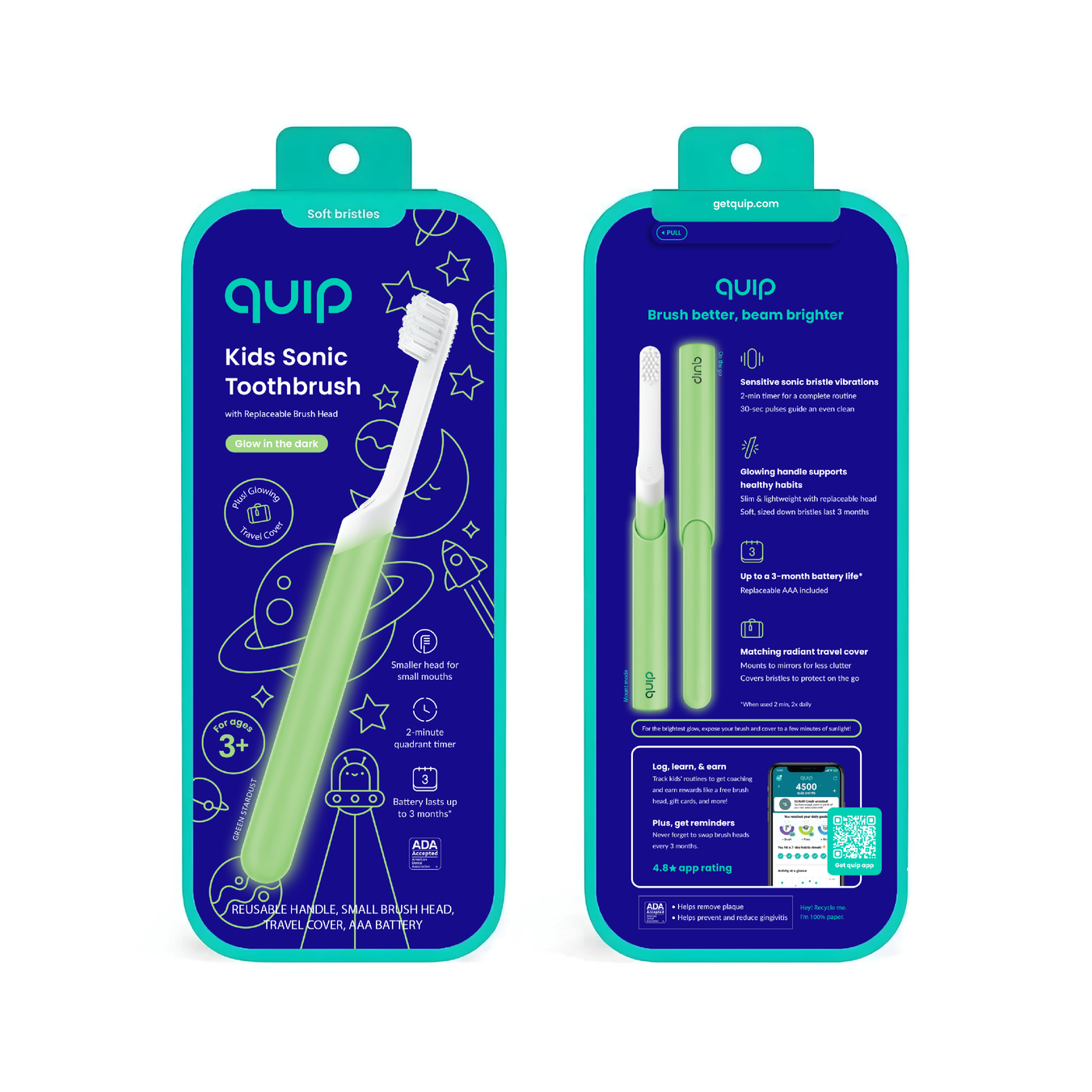
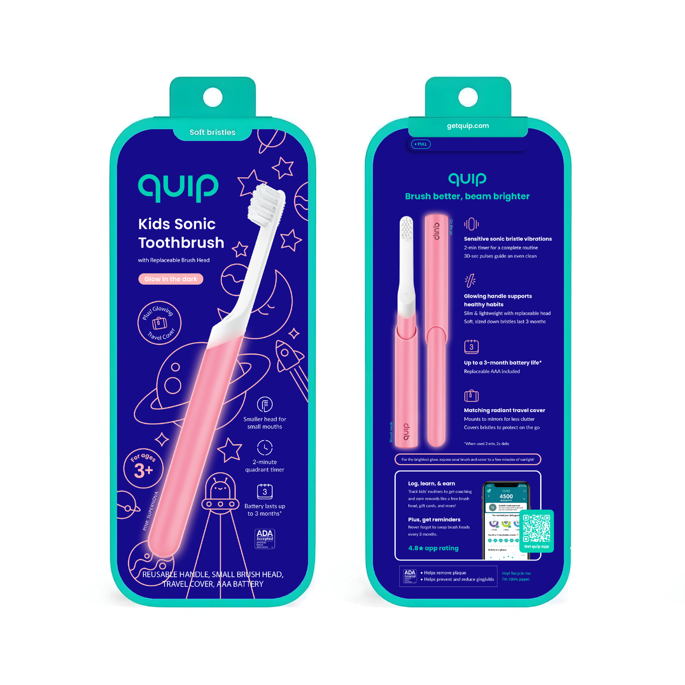
quip — kids limited edition retail packaging
brief
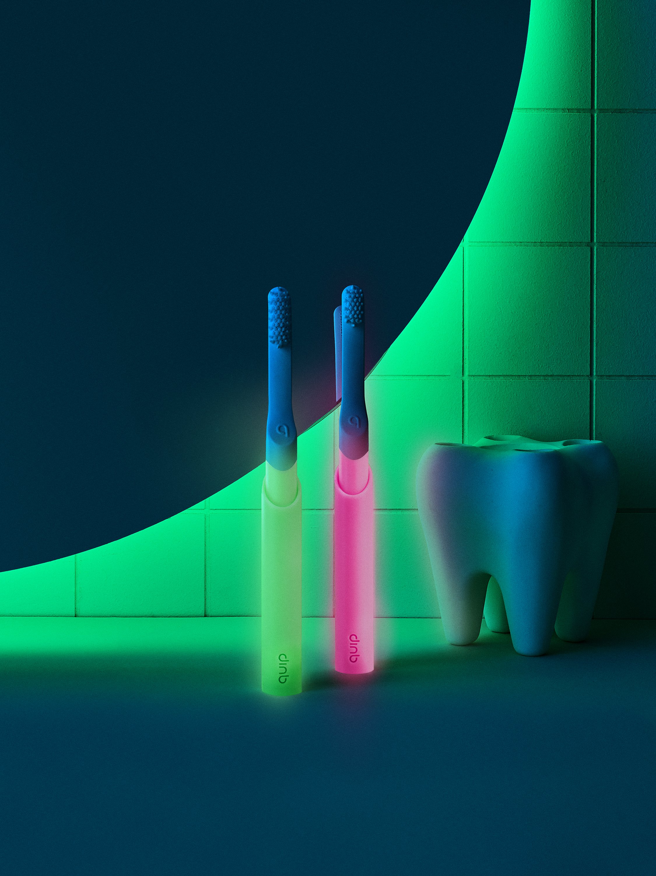
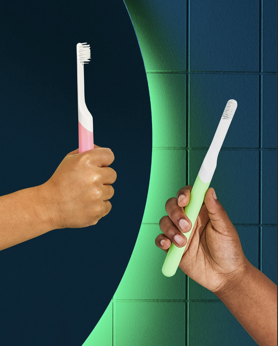
support the launch of quip’s limited edition glow in the dark brushes
challenge the scope of print techniques to disrupt the kids market
increase shelf appeal
keep it fun
do not rely on character licensing or defined mascots
retain quip’s packaging guidelines
responsibilities
graphic design
illustration
production files
sampling: spot colors, ink density, and glow in the dark coatings
supplier feedback
final file release for mass production
outcome
brand consistency: visually aligned with quip’s kids and adult packaging guidelines: typographic hierarchy, full-flood color, render placement, scale, marketing content, and regulatory certifications.
brand expansion: bright packaging that glows on shelf (literally!); new space-themed and whimsical illustrations
creative direction: melissa shelton
visual packaging and graphic design: alexandra morton
illustration: alexandra morton
structural packaging: sean wilson, jon fratti, and alexandra morton
product design: louis filosa and jon fratti