chefman — rebrand and packaging
brief
create a new brand identity that engages, inspires, and entices home chefs
visually position the brand at the intersection of affordability and quality
disrupt the saturated and overwhelming noise of the appliance aisle
prioritize the accessibility and friendliness of the chefman experience
responsibilities
brand strategy
identity design
packaging design
outcome
brand positioning: a bright, streamlined identity encourages novice cooks to join the chefman family, hone skills, and master cooking at home
packaging: primary brand touchpoint; systematic and scalable across all appliance cartons, from small immersion blenders to large grills
brand identity: brand assets increase shelf-appeal without overwhelming the customer: clear typographic hierarchy ensures copy legibility, an underlying grid generates consistent icons and clarifying white space, full-flooded color is selectively used, product functions are tangibly visualized with illustrated typography, and meal-based product renders substantiate chefman’s claim of quality, aspirational, and user-friendly appliances.
previous identity
rebrand
logo
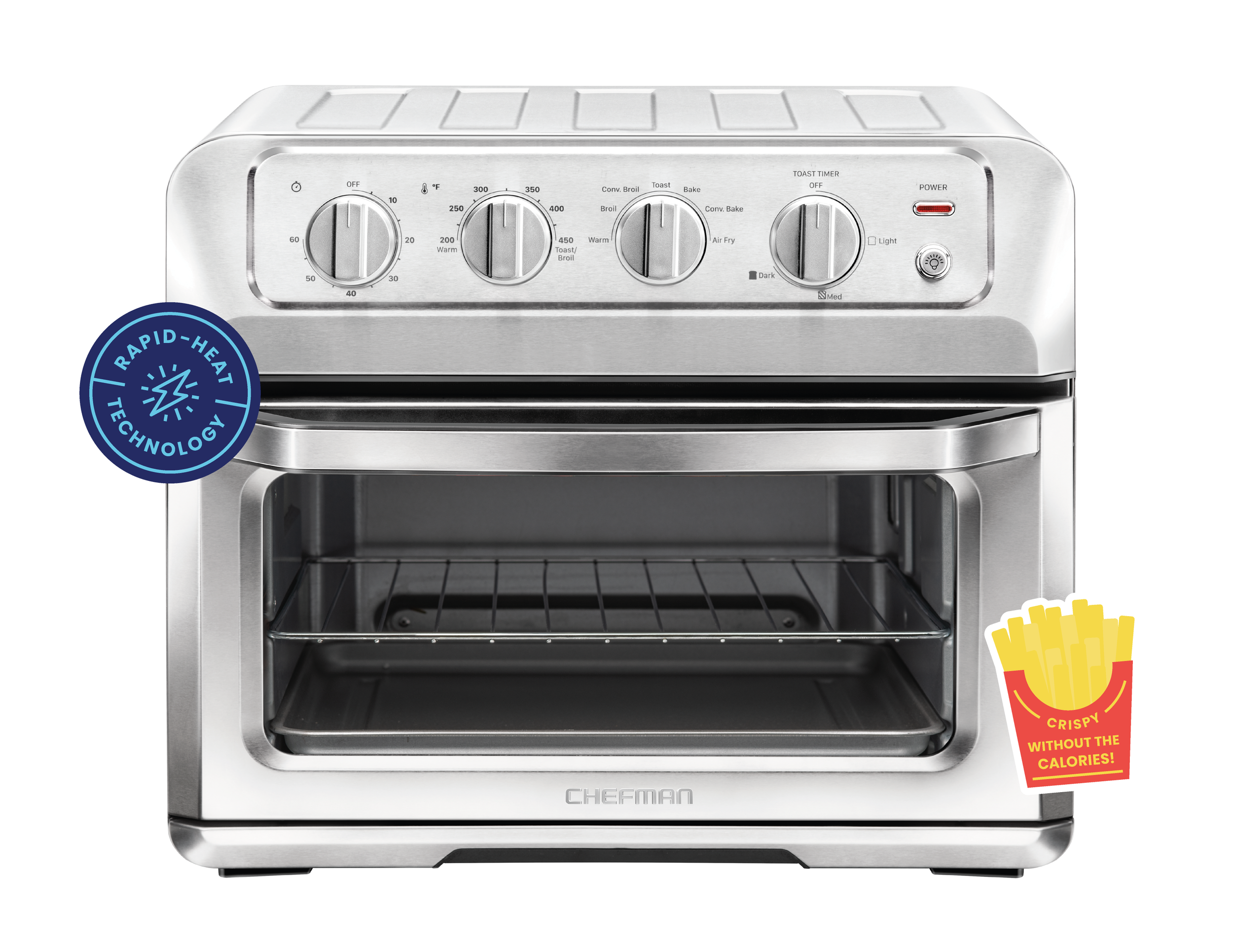
rounded edges and streamlined letterforms soften the original chefman logo, establishing the brand as an innovative, user-friendly, and confident purveyor of appliances for amateur chefs in every home.
typography
poppins is a competent, approachable, and modern typeface. designed in a range of flexible weights, poppins affirms chefman’s welcoming and adept brand positioning.


color
energetic color differentiates the chefman brand in the food and appliance industry, where dark hues are predominately featured. the colors below are derived from recipes that chefman uses to guide and encourage home cooks to try their extensive line of products.

icons
a comprehensive icon library was developed to express product function across all print and digital channels. each icon was designed on a flexible grid system in order to support chefman’s robust product portfolio.
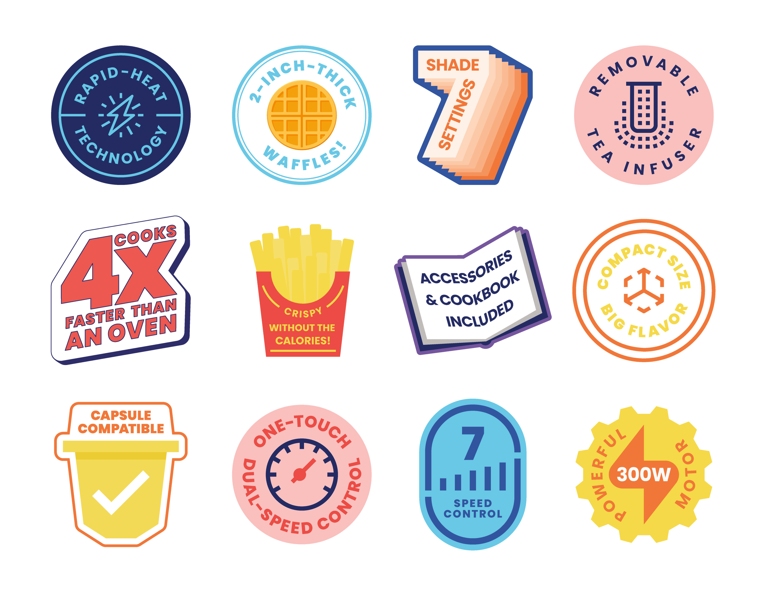
stickers
illustrated “sticker” call outs highlight the key features of each chefman product across print and digital applications.
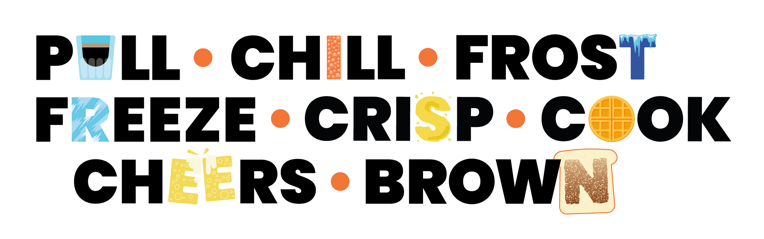
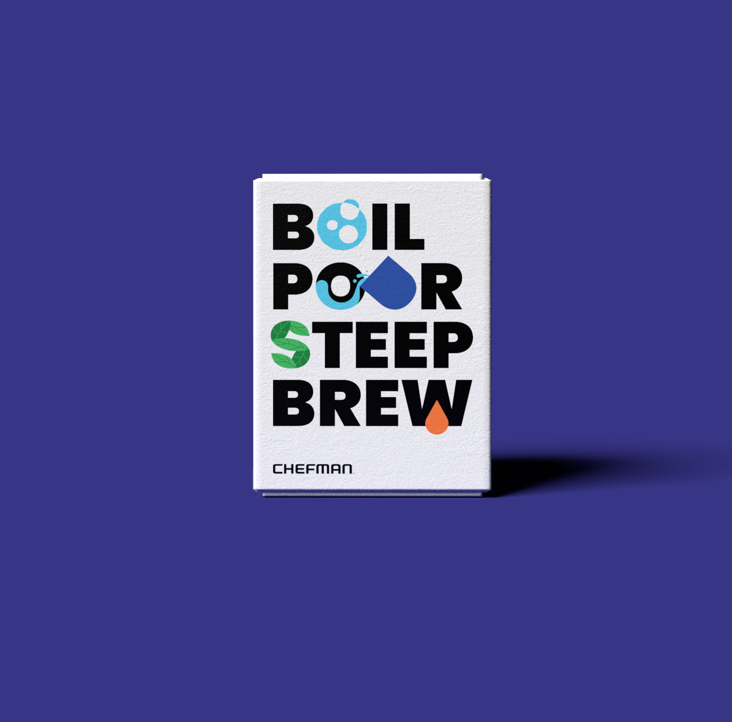
illustrations and custom typography
playful illustrations visualize and personify each product’s core function, reminding customers that they can easily and enjoyably integrate chefman products in their own daily routines.
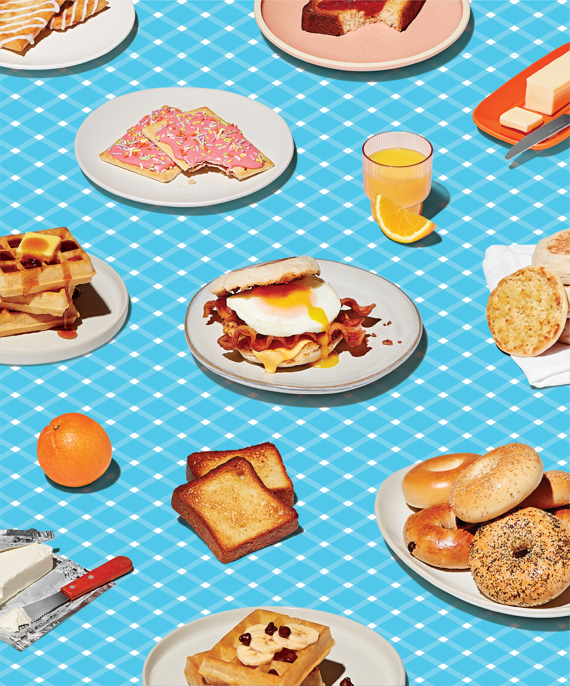
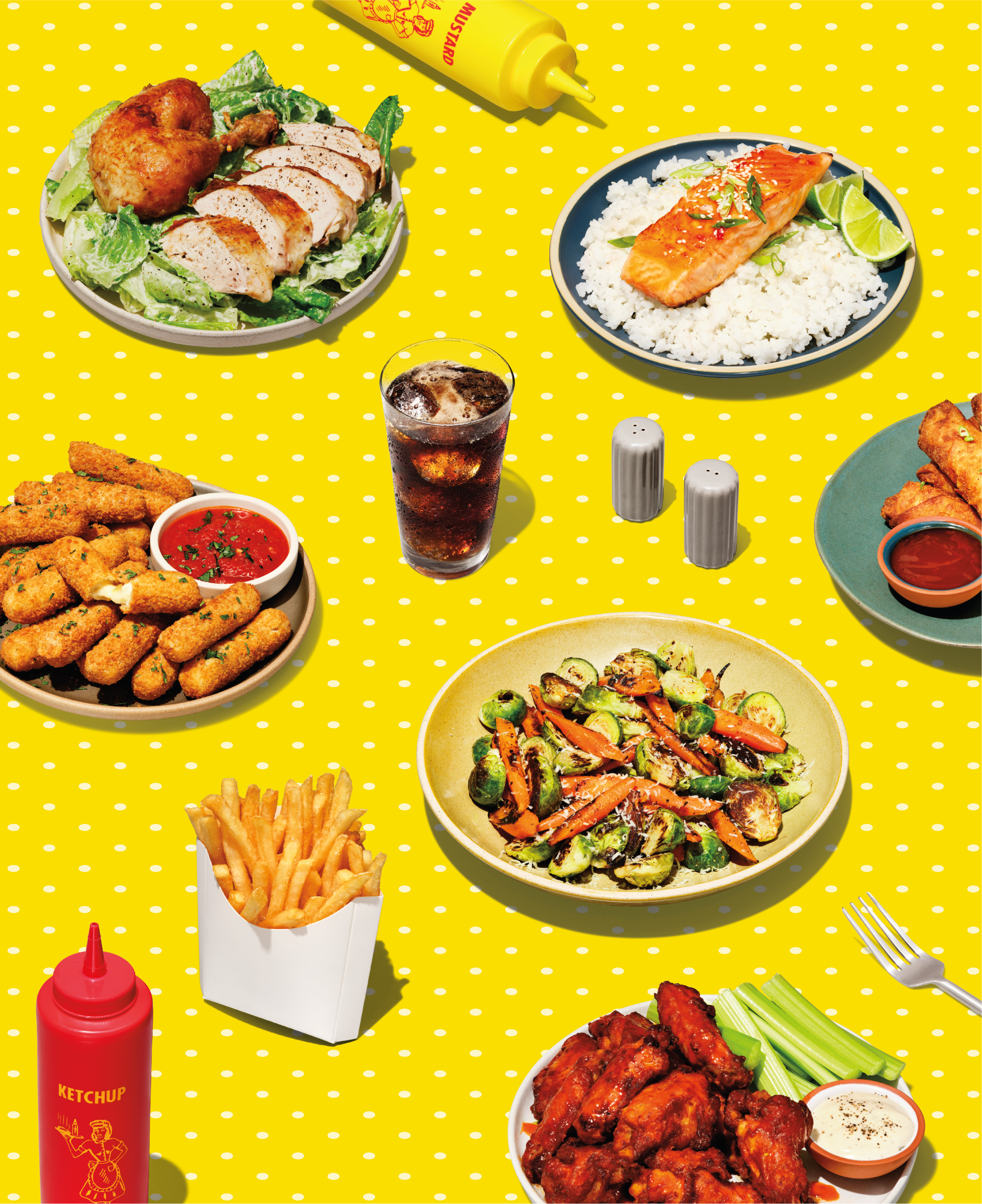
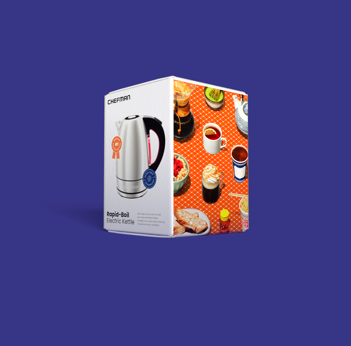
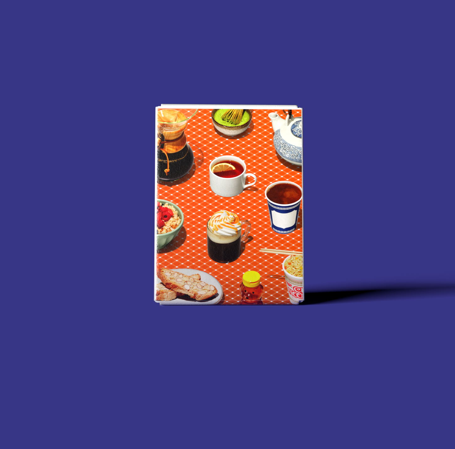
patterns and isometric imagery
signature patterns and isometric imagery flood side paneling on chefman packaging. Beyond aesthetics, these visuals highlight the diversity of Chefman’s product lineup and the variety of recipes customers can successfully create with them.
packaging
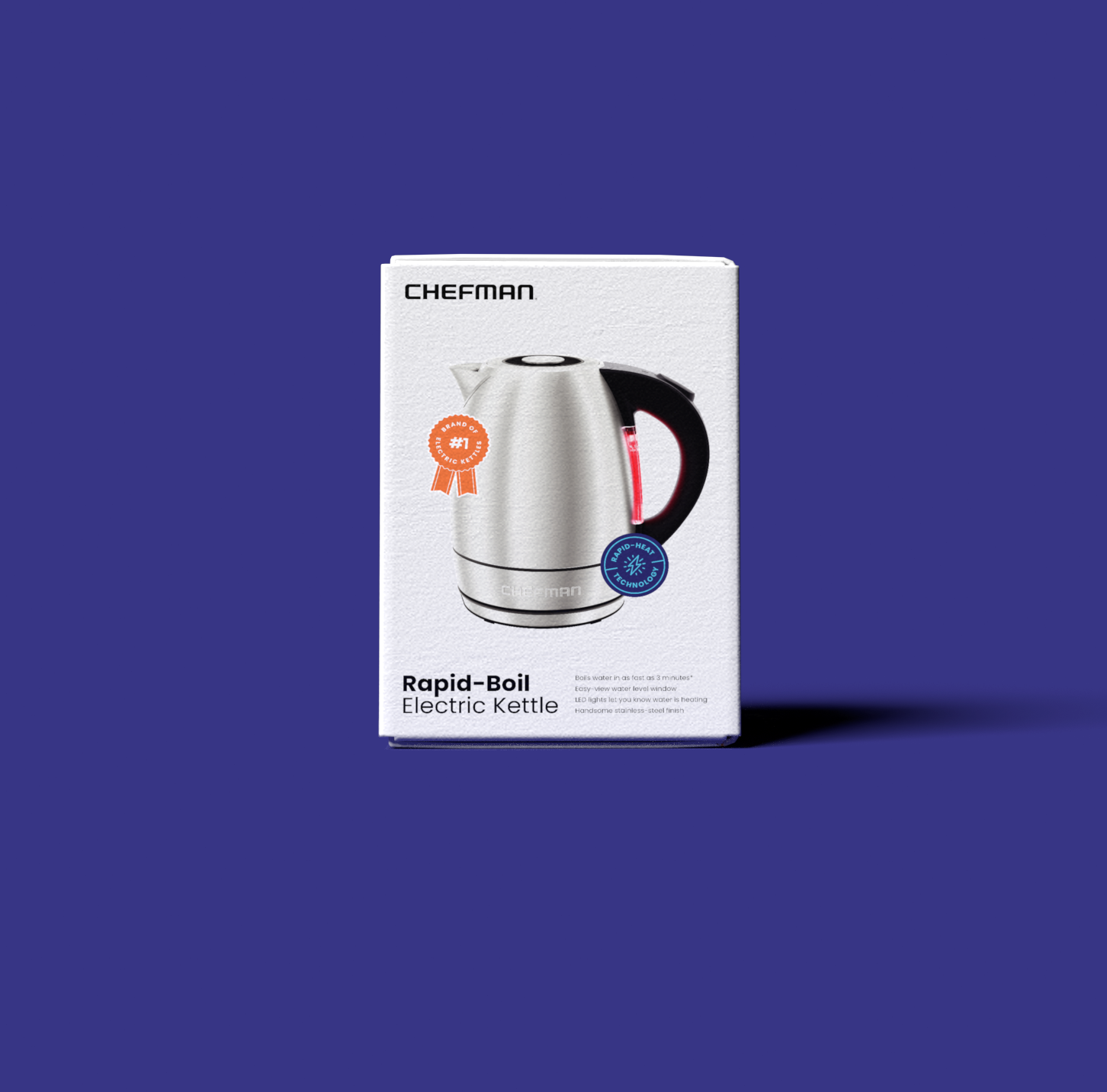

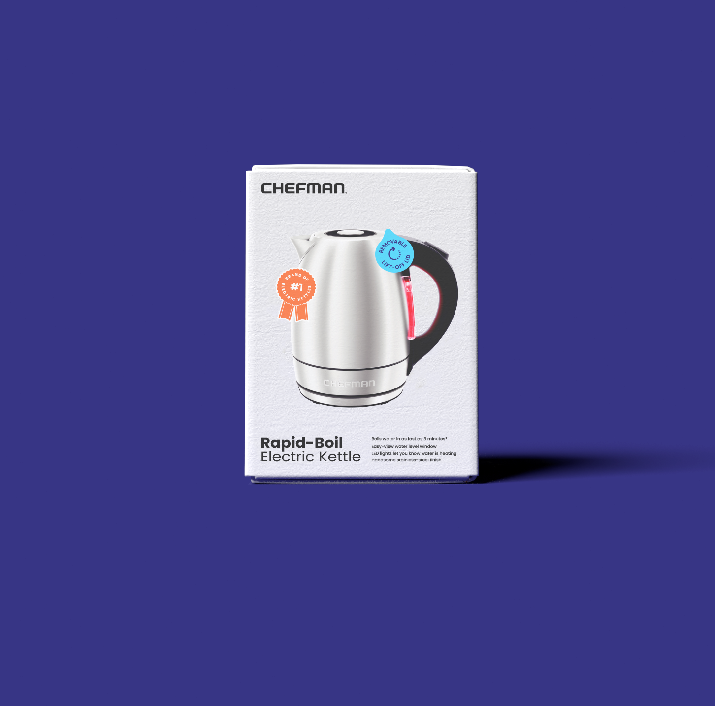
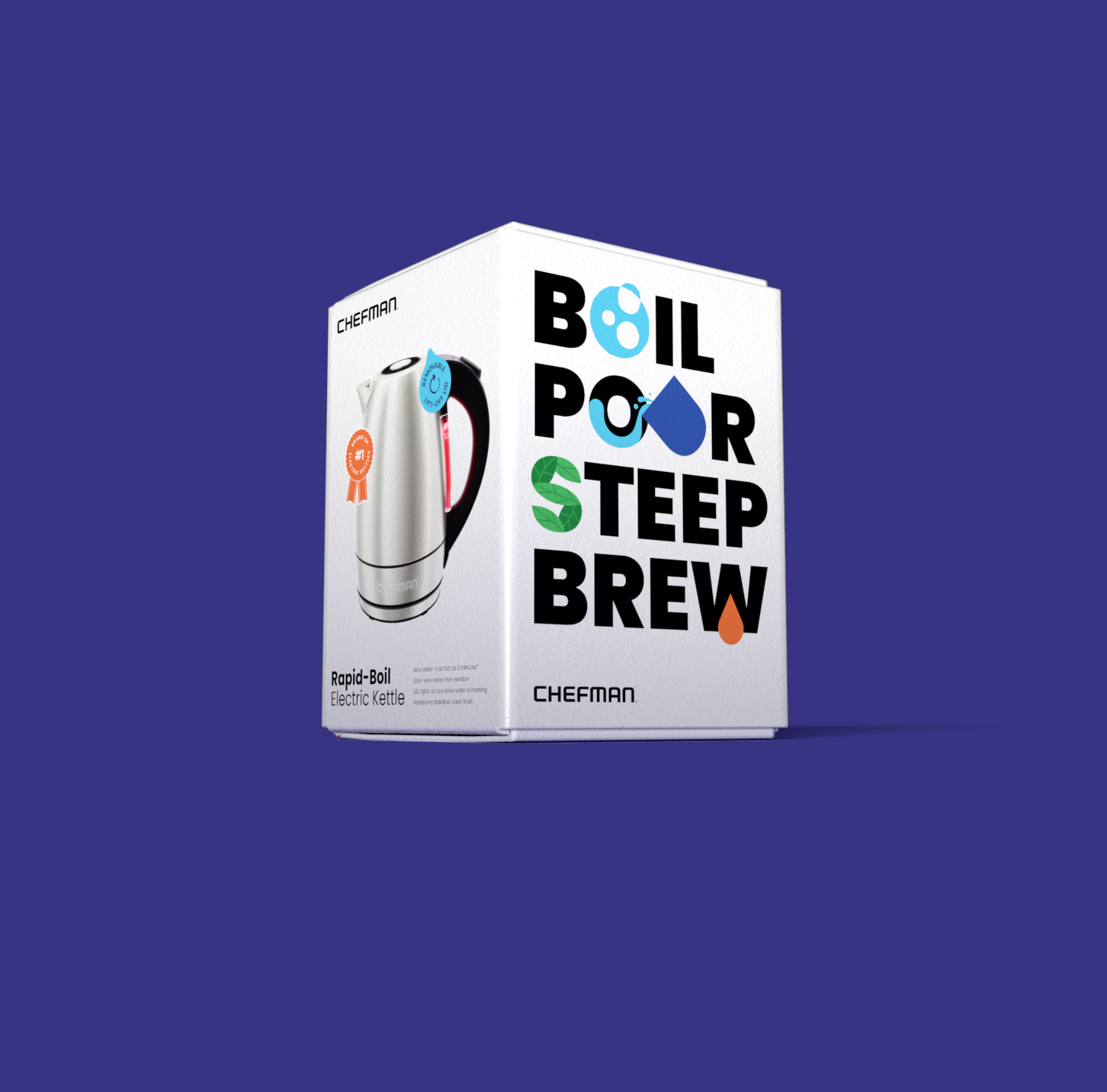
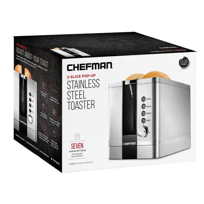
01 — front of pack
front of pack features a hero render with the product actively performing its key function. the chefman logo remains grounded in the upper lefthand corner of the outer carton. the product name is emphasized in bold type, followed by the product category in regular weight. next to the product name, four core functionalities are explained in easy, conversational language. all type is set on a scalable grid to ensure a consistent typographic system across product packaging of different dimensions. key features and merits are expressed with illustrated, “sticker” badges that are fun and approachable.
02 — side of pack
side packaging features isometric food imagery and bold table layouts to whet appetites and attract attention on shelf. all featured food can be made with the product itself. on the opposite side, core product functions are visualized with illustrated letterforms, defining the appliance’s primary capabilities at a glance.
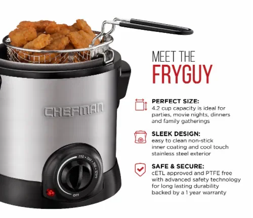
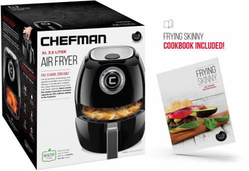
03 — back of pack
back of pack features an additional hero render with different badges for flexible messaging. with product renders on the front and back of the package, chefman doubles its chance of customer outreach, even if planograms shift during retailer stocking.
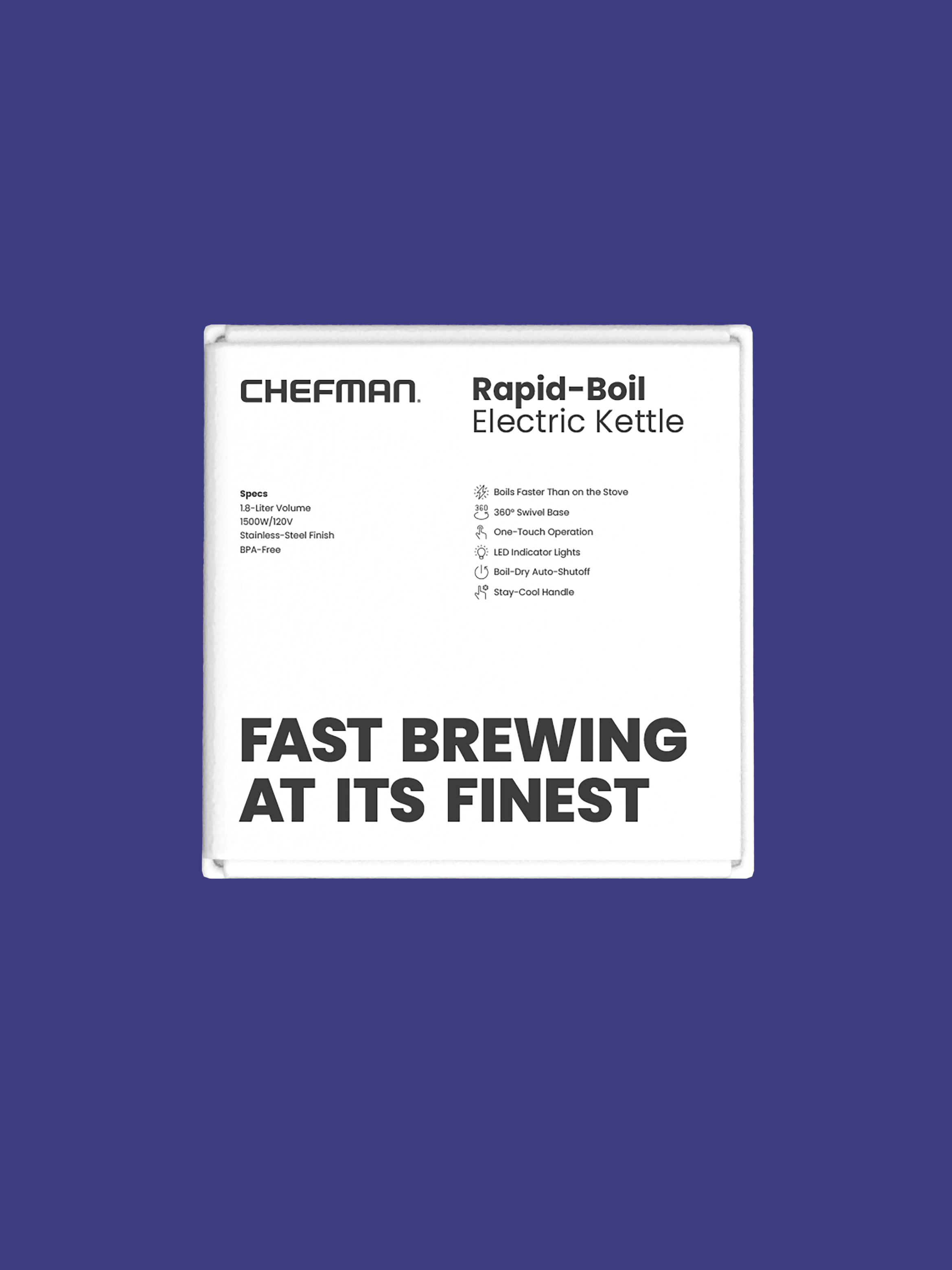
04 — top of pack
top of pack features chefman’s logo and the appliance’s product name and category. product specs and expanded value propositions are outlined, allowing for quick, “big picture” comprehension. a bold tag is positioned at the bottom of the pack.
creative direction: tamer koseli
graphic design: tamer koseli and alexandra morton
visual packaging: alexandra morton