wild one — packaging rebrand
A complete redesign of Wild One’s packaging showcases the brand’s full product line, including walking, play, treat, and wellness categories. Core product packaging uses tan paperboard with clever tab systems to secure leashes, collars, and toys. A singular tan swatch makes core products instantly recognizable, keeping the brand’s brightly colored products in focus. to integrate product and package, Swooping graphic lines across the paperboard echo the shapes of the products themselves. As packaging expands to include supplements, treats, and grooming items, full-color treatments differentiate secondary product lines from wild one’s core collection. Across all packaging, bold typography, streamlined icons, and expressive illustrations create a modern, colorful, and cohesive brand experience.
full system


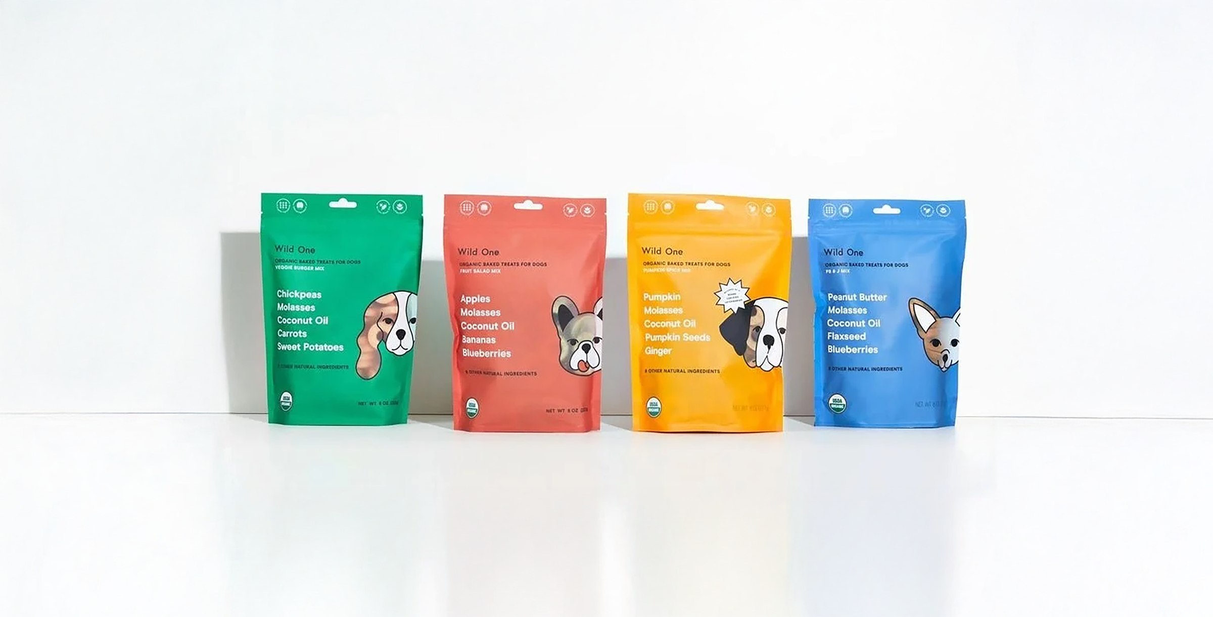
treat packaging — highlight
clear cut outs reveal each unique treat, facilitating easy on-shelf identification and sparking customer interest.
supplement packaging
full color backgrounds, clear typographic hierarchy, and unique illustrations intuitively communicate the core benefits of wild one’s supplements.


organic social


creative direction: minali chatani
visual and structural packaging: alexandra morton and lauren brynn lucas viana
photography: sam Liebeskind